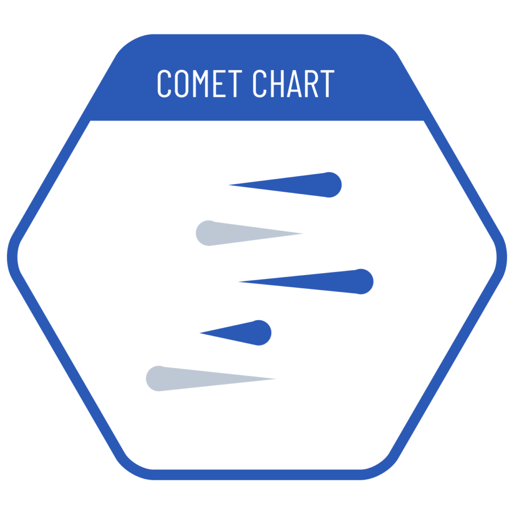
When we want to show the change between before-after values in a dataset, we can use the comet chart which is a type of lane charts. In this chart, the current values are shown with a circle, the previous values are shown with the sharp tip of a triangle, and the differences are compared by the length between them. This allows us to clearly see the position of the current value, while the previous value appears smaller and less significant. As the direction of the difference is also important, we can express this by using color.
VISUAL PERFORMANCE CHART
VISUAL CREATION PLATFORMS

Do you have any ideas or examples related to this graphic that you would like to see published here?
Share Here