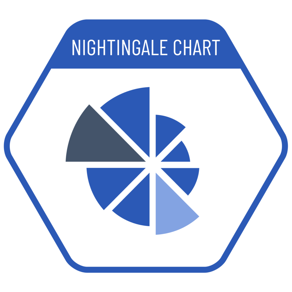
Nightingale charts are used to visualize temporal changes in data and compare different values within a specific category. Florence Nightingale developed this type of chart in the 1850s to illustrate mortality rates in military hospitals during the Crimean War. Compared to stacked column or stacked area charts, Nightingale charts have the advantage of clearly showing seasonal variations in deaths. Therefore, they will lose their advantage in data sets that do not consist of one year or cycles of 4 (or multiples of 4) time periods.
VISUAL PERFORMANCE CHART
VISUAL CREATION PLATFORMS

Do you have any ideas or examples related to this graphic that you would like to see published here?
Share Here