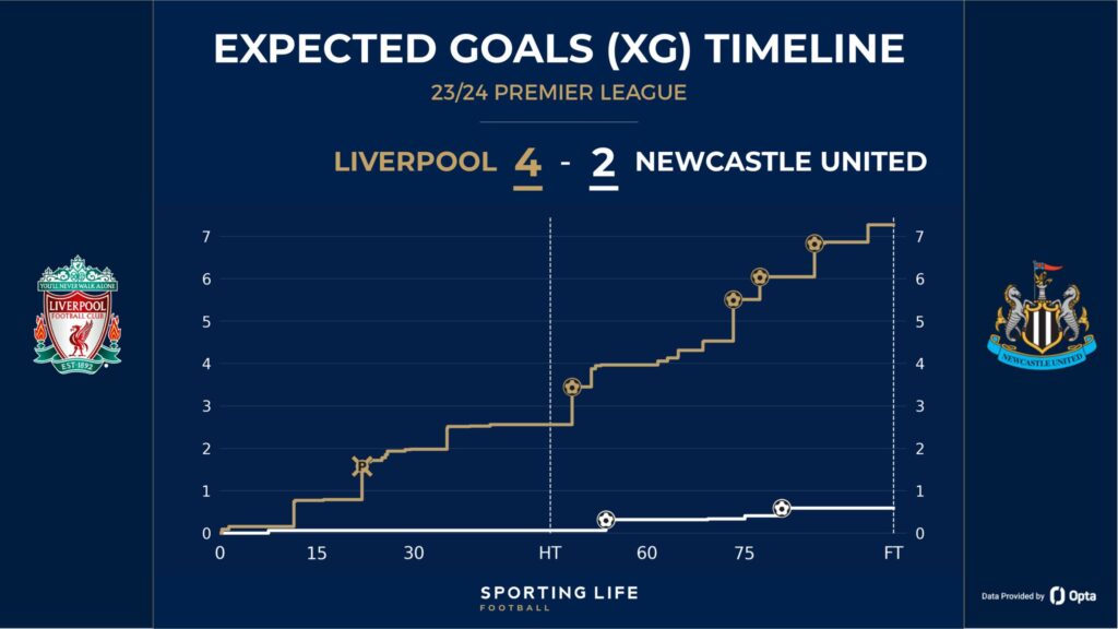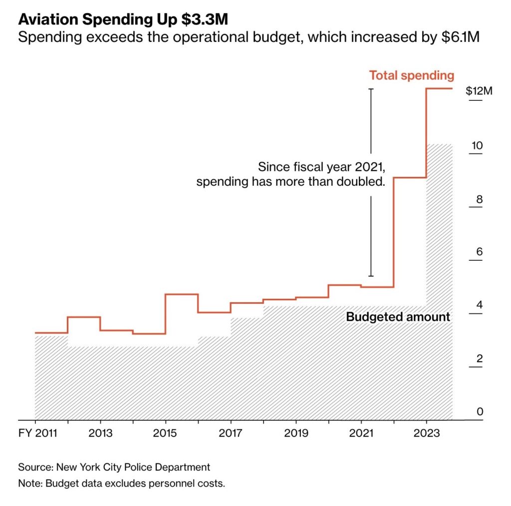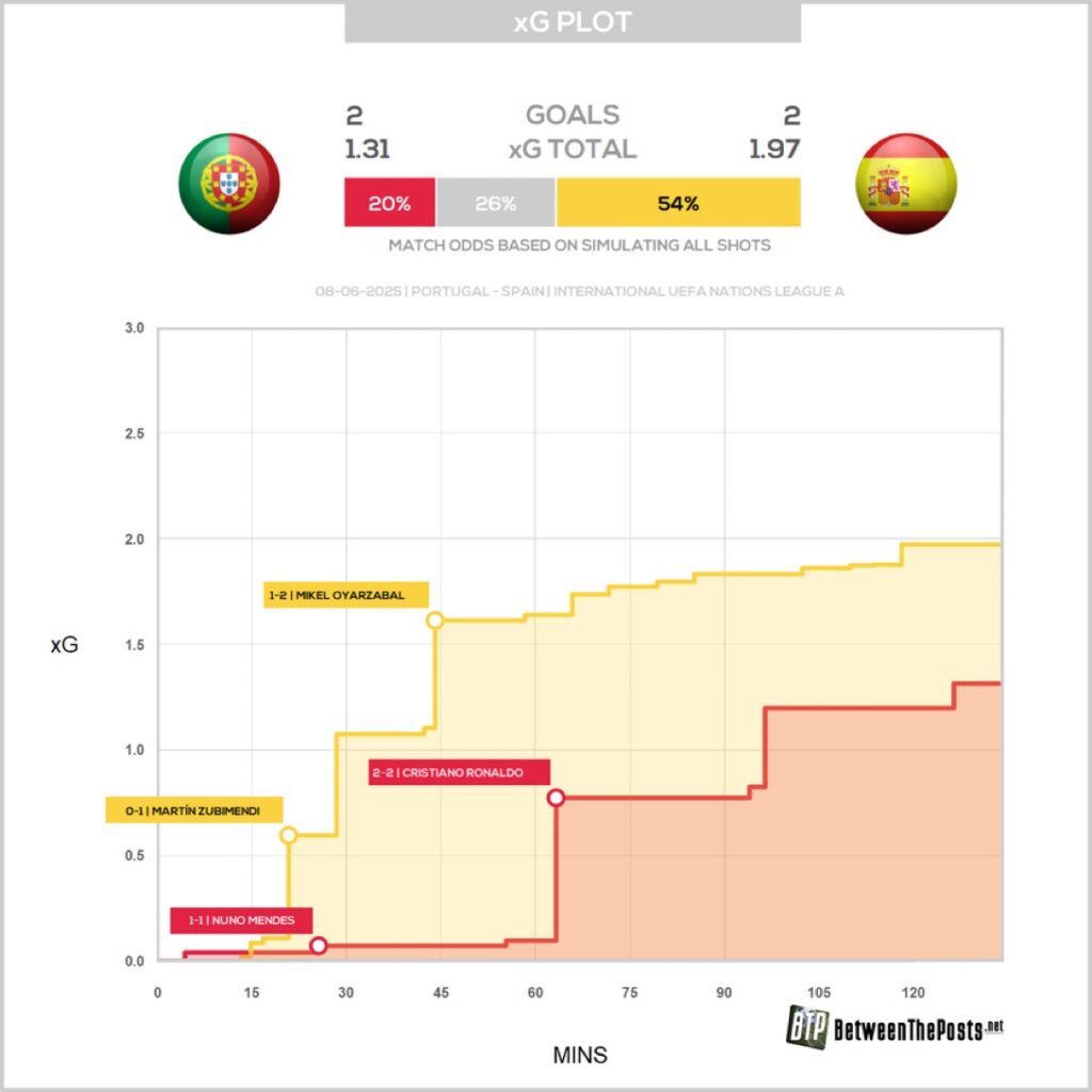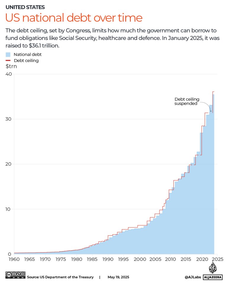
When we want to visualize the change in values over time using a discrete dataset, a step chart is the most appropriate option. This is particularly relevant when the changes are instantaneous, or when there are missing values for certain time points in our dataset. In such cases, using a line chart could misrepresent the data, potentially misleading the audience. A step chart clearly visualizes where the data remains constant and how much it changes at specific moments.
VISUAL PERFORMANCE CHART
VISUAL CREATION PLATFORMS

SAMPLE IMAGES
Do you have any ideas or examples related to this graphic that you would like to see published here?
Share Here
