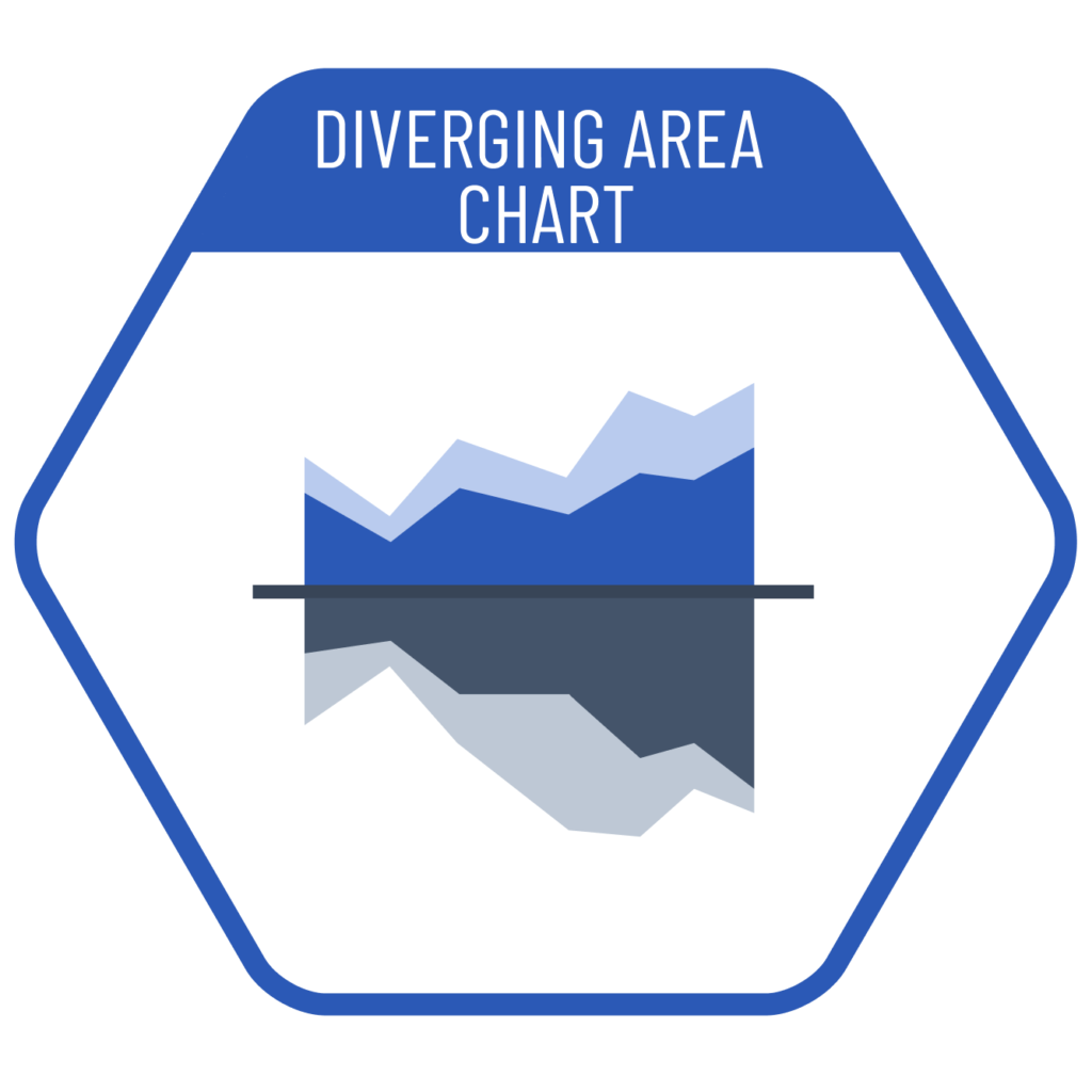
When we want to compare the total of positive and negative values over time, we can use diverging area charts. While similar in logic to stacked area charts, this type of chart does not represent the total of positive and negative values. Instead, it allows us to compare the totals of two opposing or comparable data sets. If the chart is symmetrical, it indicates that the values are equal; if the symmetry is broken, it shows that there is a difference between them.
VISUAL PERFORMANCE CHART
VISUAL CREATION PLATFORMS

SAMPLE IMAGES
Do you have any ideas or examples related to this graphic that you would like to see published here?
Share Here