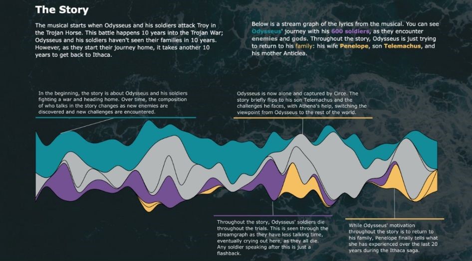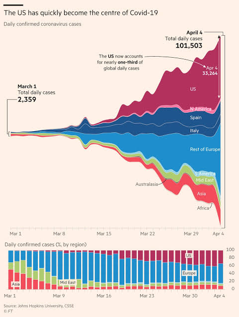
Another chart we can use to display the temporal change of totals is the stream chart. Especially when one of our data series has values significantly larger than the others, we can use a stream chart to smooth out its high values. In this chart, values are distributed equally above and below the axis. To refine the visual representation, small random values are added, slightly manipulating the appearance. While this can sometimes lead to misleading interpretations of the exact values, it makes it easier to grasp the overall trend.
VISUAL PERFORMANCE CHART
VISUAL CREATION PLATFORMS

SAMPLE IMAGES
Do you have any ideas or examples related to this graphic that you would like to see published here?
Share Here
