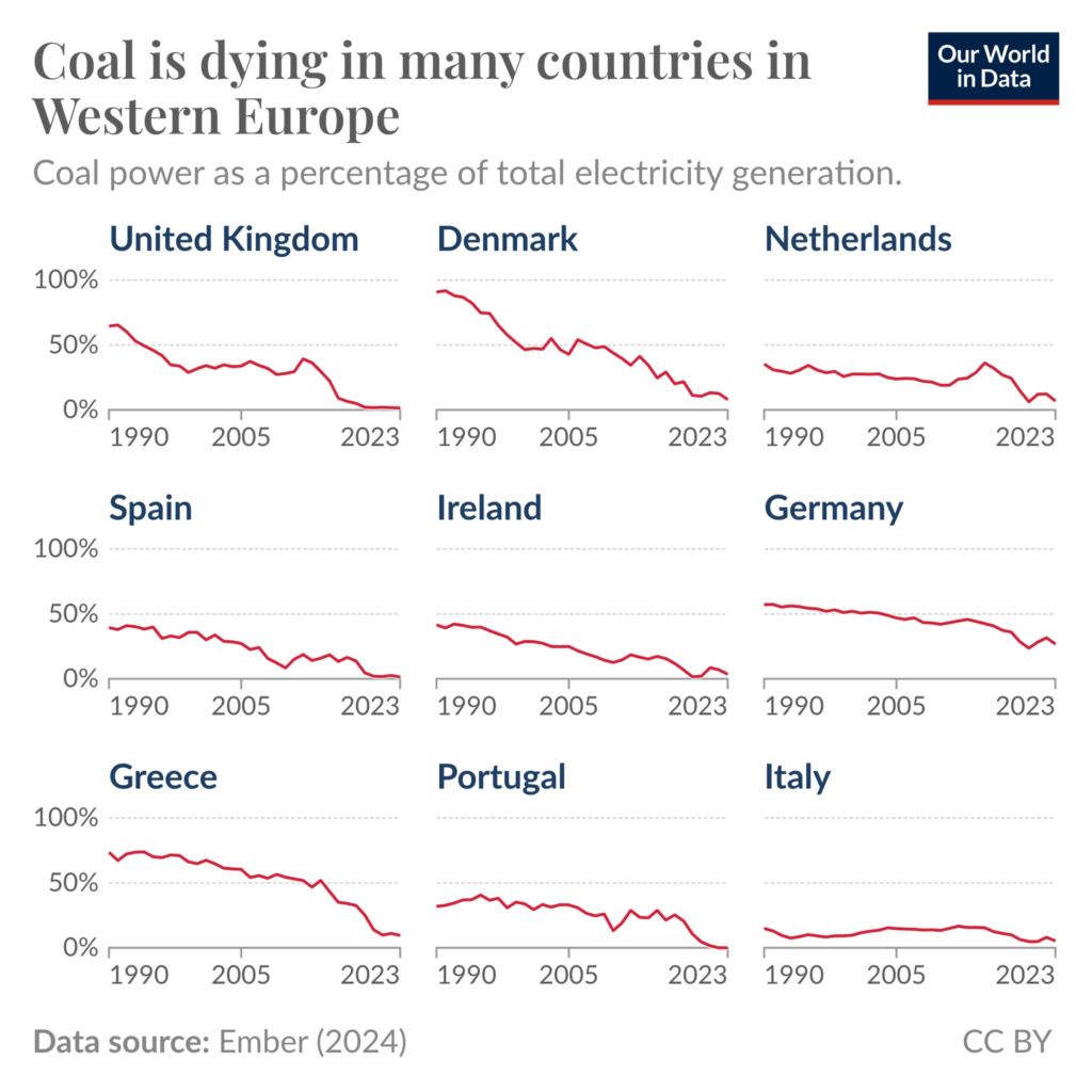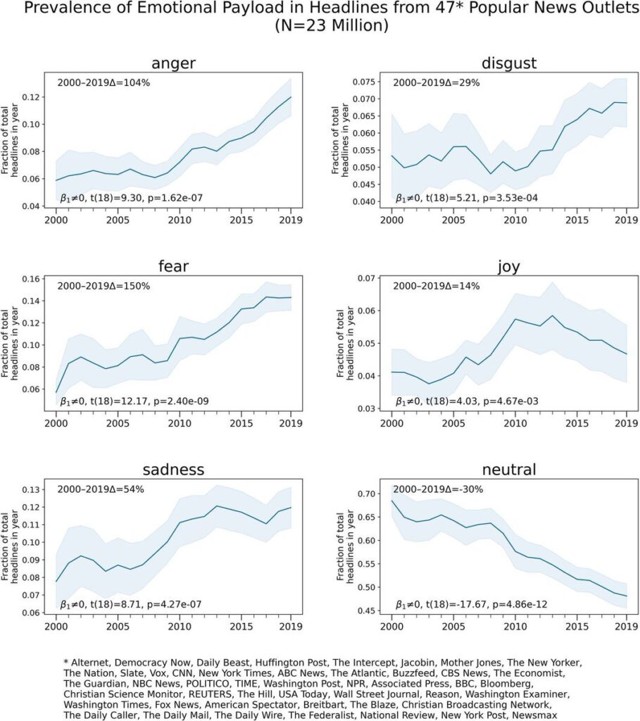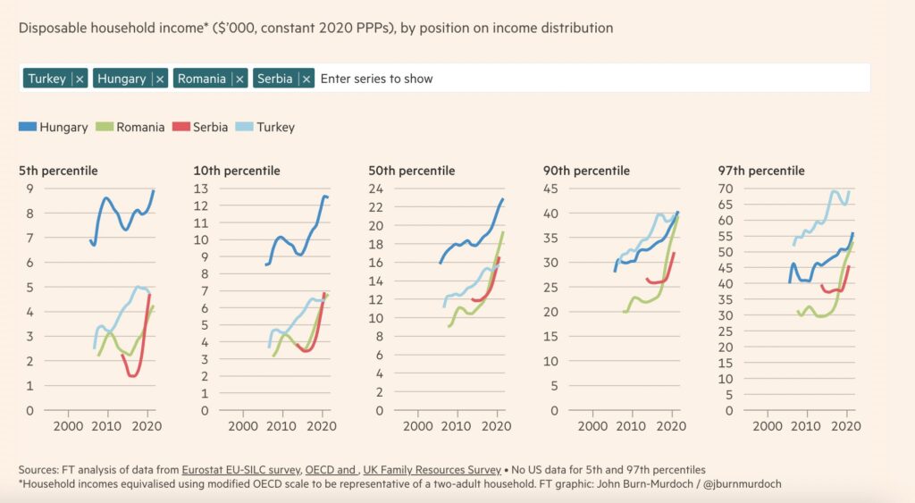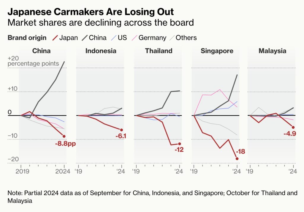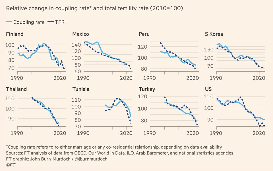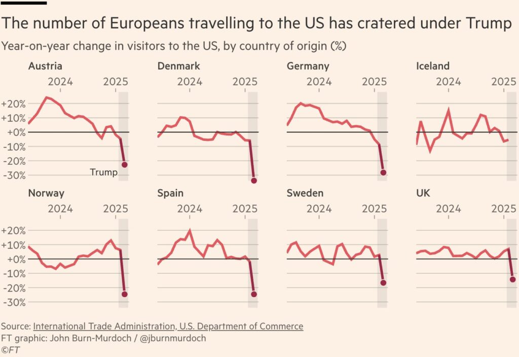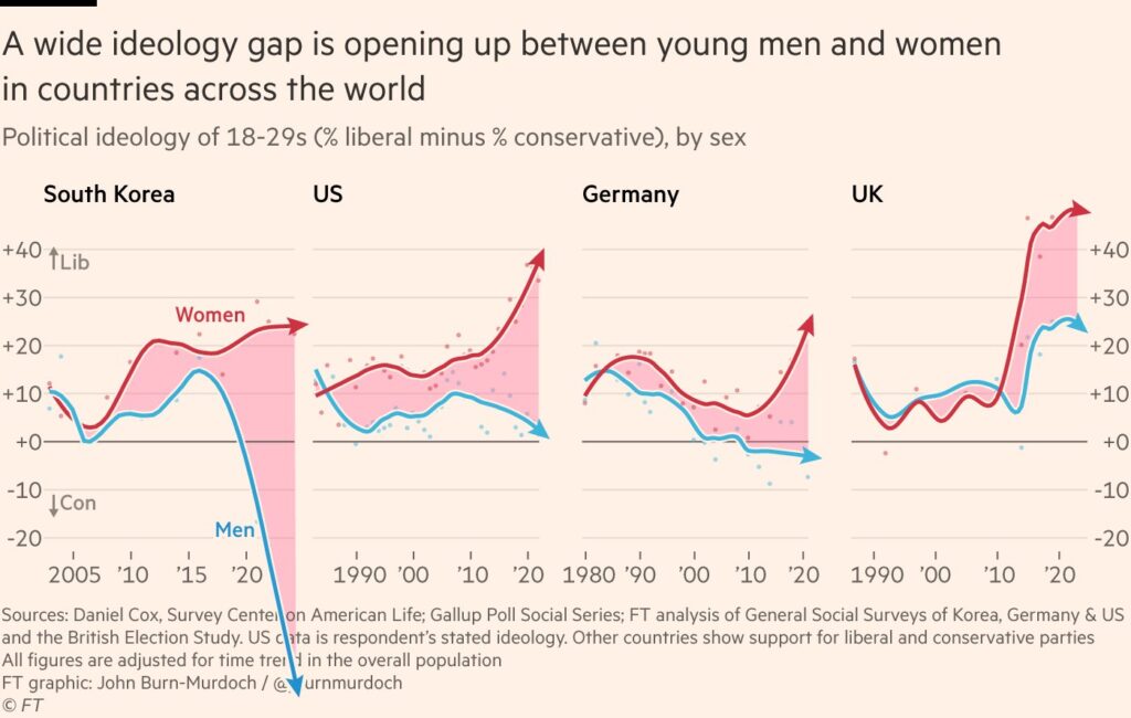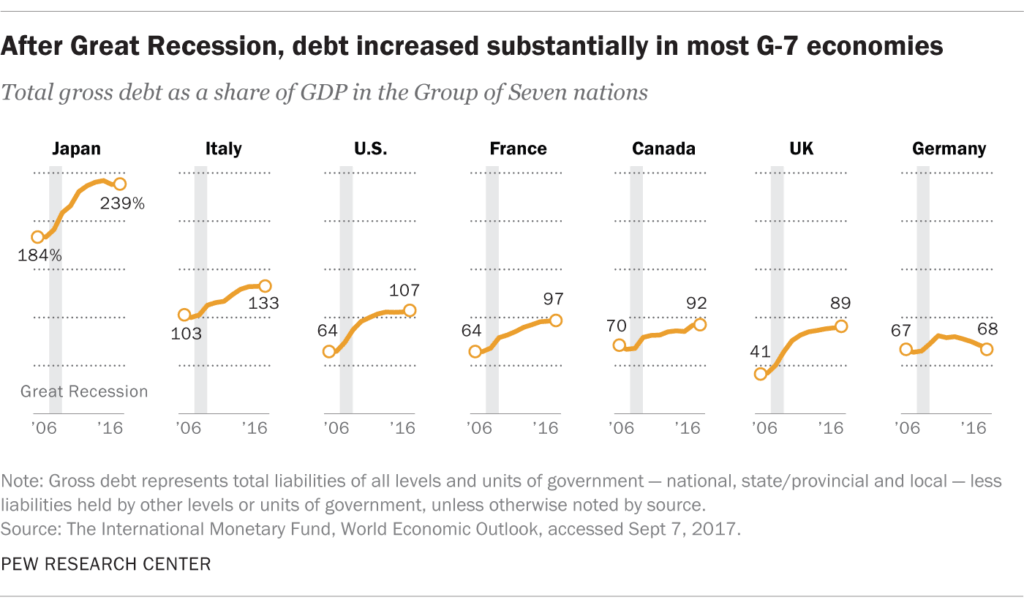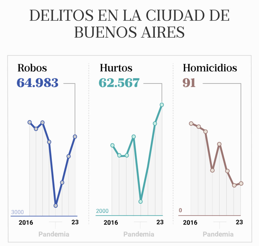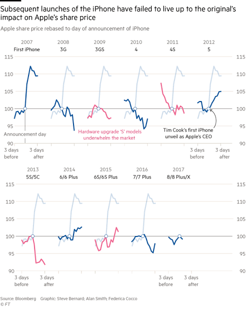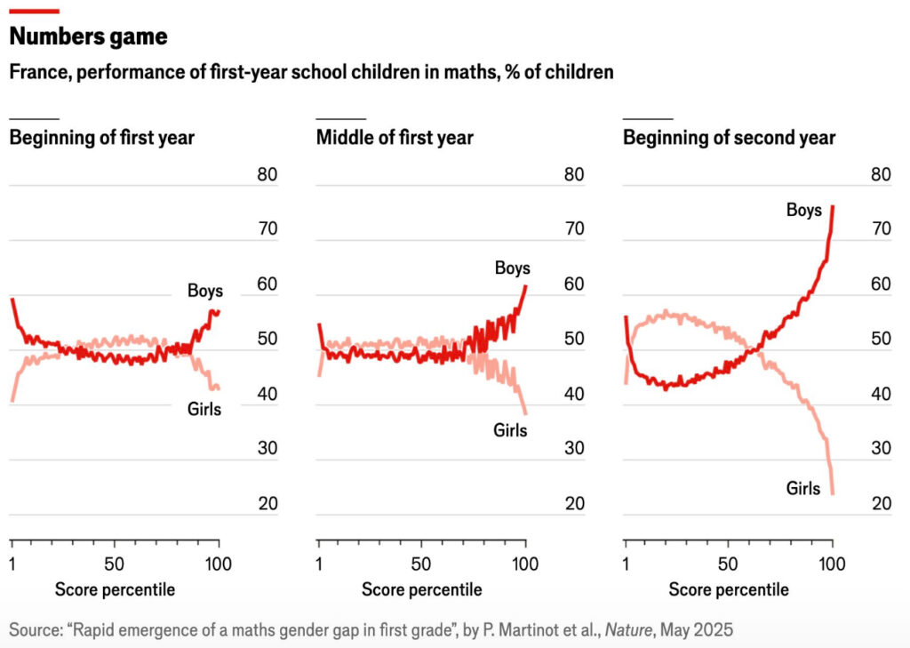
When multiple data sets move closely together within the same time frame, line charts become cluttered. To address this, we can create multiple line charts by duplicating the time axis as many times as the number of data sets we want to display and highlighting only one dataset per time frame. If we also want to compare the values at specific moments, we can continue to display the other datasets in gray in each section. In some cases, the area version of the chart can be also preferred instead of lines.
VISUAL PERFORMANCE CHART
VISUAL CREATION PLATFORMS

SAMPLE IMAGES
Do you have any ideas or examples related to this graphic that you would like to see published here?
Share Here