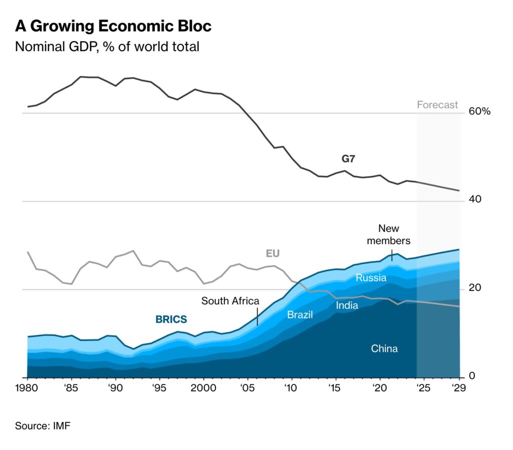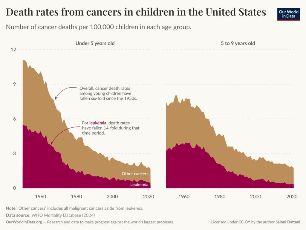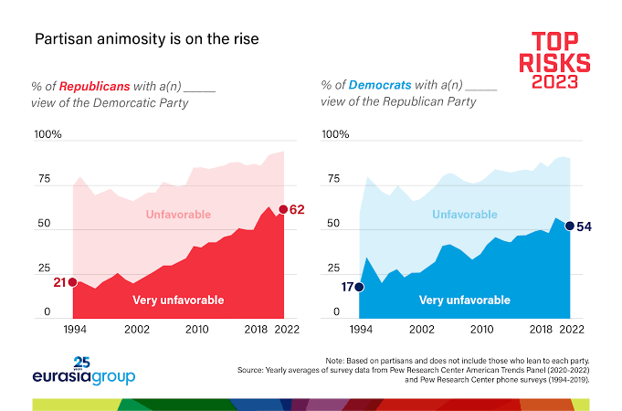
If we have multiple data series that change over time and we are interested in their overall total over time rather than each one individually, we can use stacked area charts. Some data visualization tools may suggest using a stacked line chart instead, but stacked line charts lack visual cues to indicate that the lines are cumulatively stacked on top of each other. For this reason, stacked area charts are the best choice for visualizing the temporal change in a total value.
VISUAL PERFORMANCE CHART
VISUAL CREATION PLATFORMS

SAMPLE IMAGES
Do you have any ideas or examples related to this graphic that you would like to see published here?
Share Here


