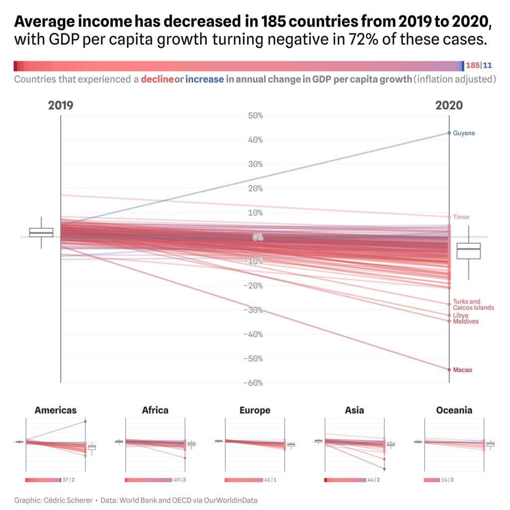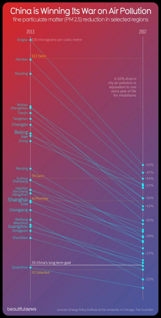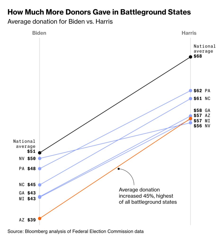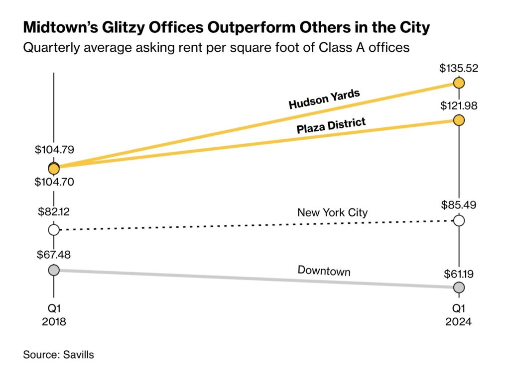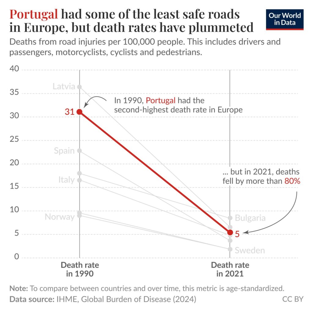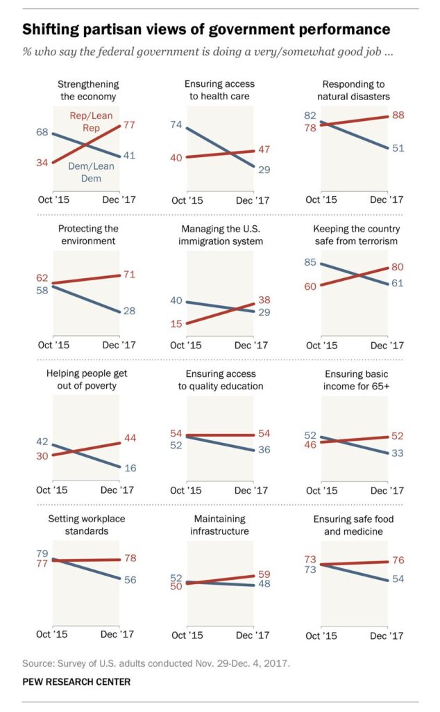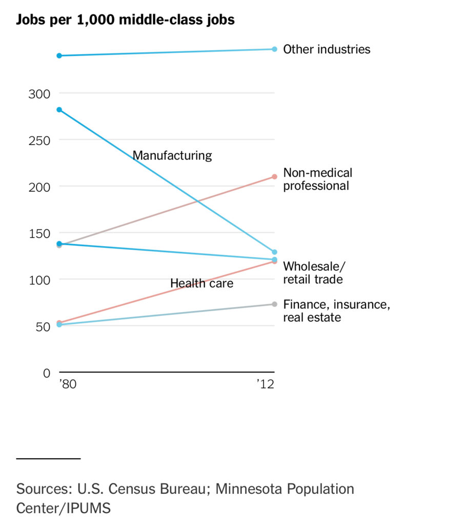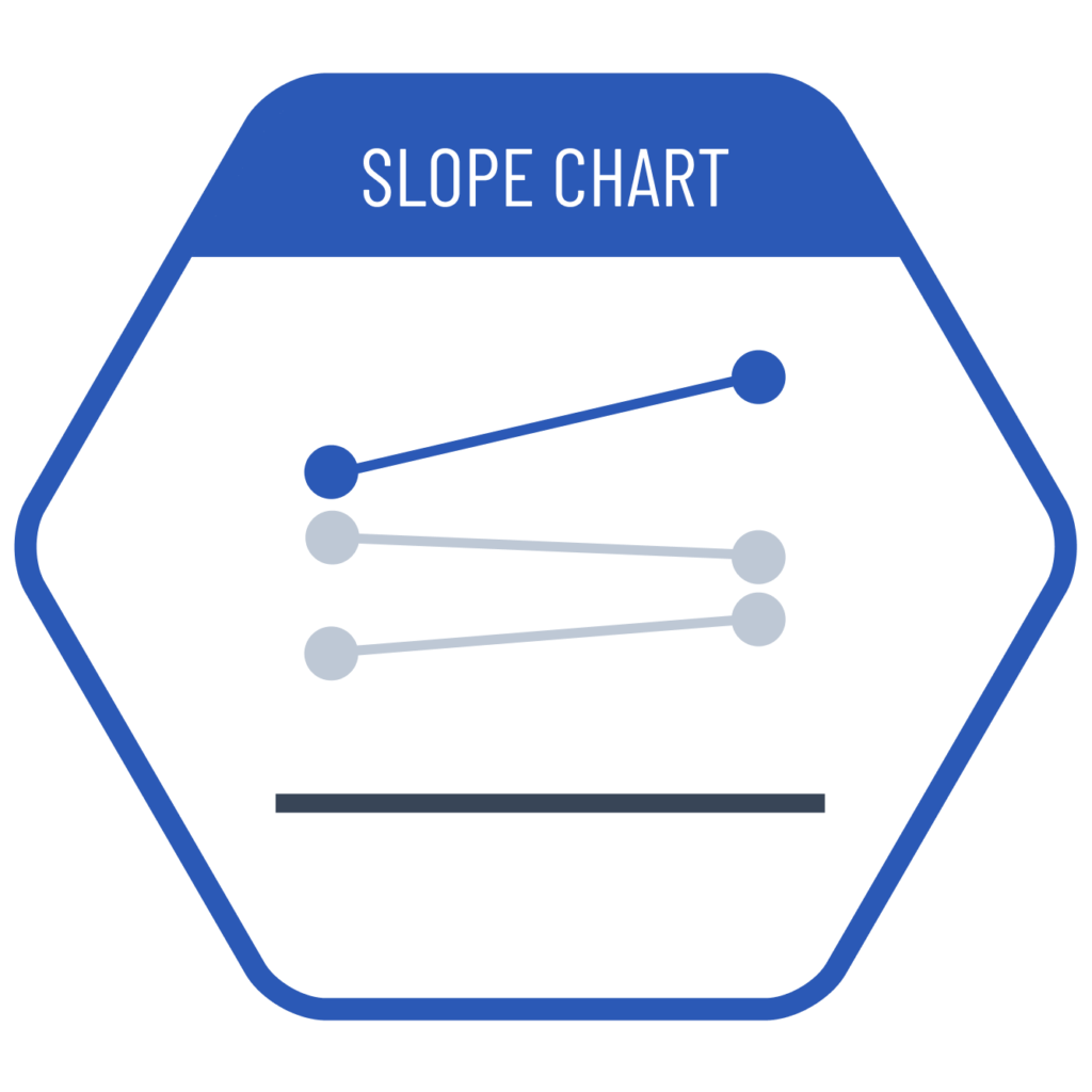
When we want to compare data across two categorical dimensions, we might need to select one comparison between two as charts based on bar length are more effective for single-category comparisons. However, if one dimension is time-related or is a level breakdown with temporal sequence, using a slope chart allows us to simultaneously make comparison based on both categories by using point heights and line slopes.
VISUAL PERFORMANCE CHART
VISUAL CREATION PLATFORMS

SAMPLE IMAGES
Do you have any ideas or examples related to this graphic that you would like to see published here?
Share Here