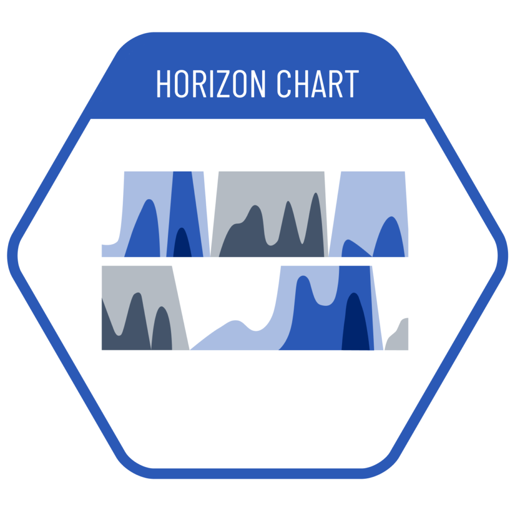
Horizon charts are one of the most complex charts to create and interpret. They provide an overview of positive and negative values or values above and below a threshold/target, and separately visualize dense and confusing datasets. As each category is shown in separate ranges, horizon charts may be the best solution for visualizing many time-series data sets that vary between positive and negative. Values of dark-colored areas are given by placing them on top of light-colored areas at the same time point. Negative values are represented by color rather than being positioned downward.
VISUAL PERFORMANCE CHART
VISUAL CREATION PLATFORMS

Do you have any ideas or examples related to this graphic that you would like to see published here?
Share Here