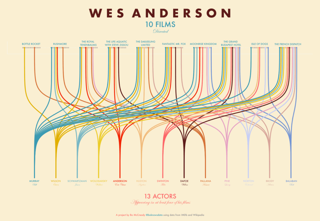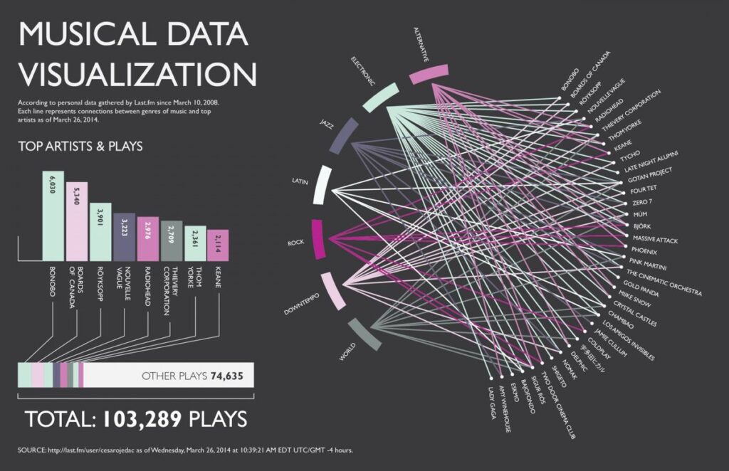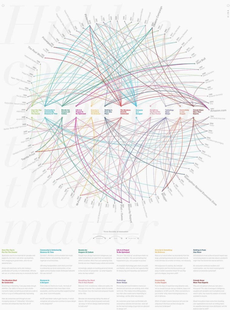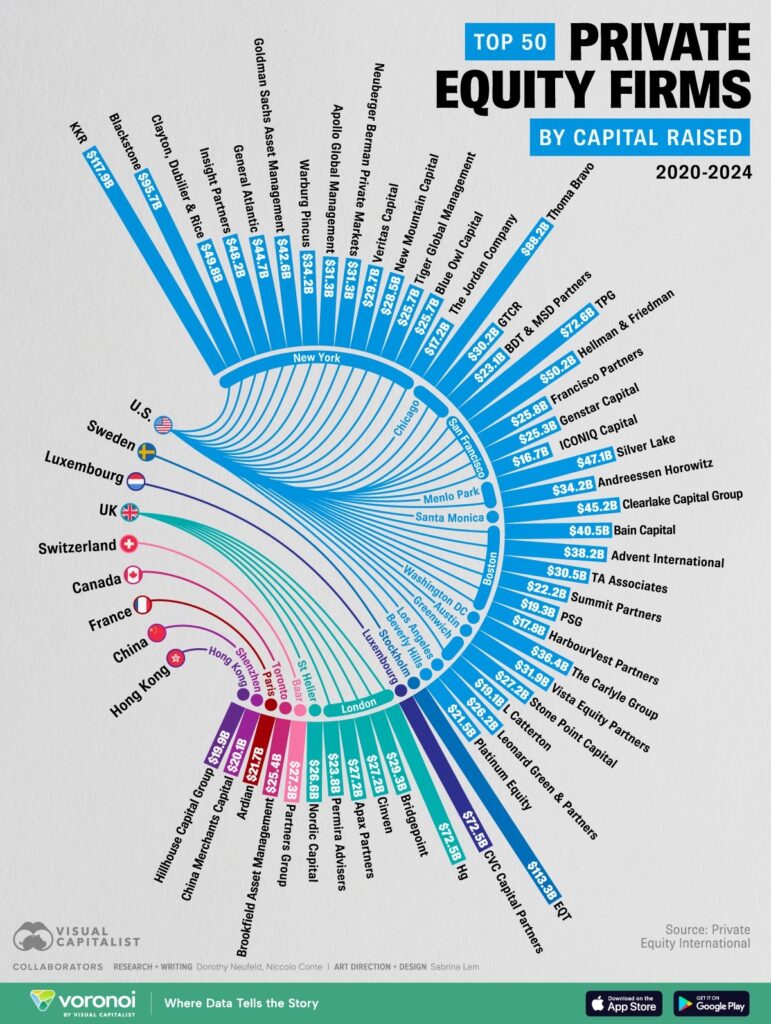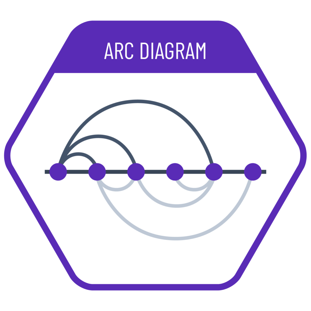
An arc diagram visually displays relationships between data points placed along a straight line using curved arcs. It is ideal for discovering recurring connections and clusters in ordered datasets (e.g., time series, text, or name lists). Deniz Cem Önduygu’s work “Philosophical Connections” visualizes the network of relationships between philosophers, based on both positive and negative intellectual influence, through a striking arc diagram. This example highlights how powerful arc diagrams can be in revealing complex relational structures.
VISUAL PERFORMANCE CHART
VISUAL CREATION PLATFORMS

SAMPLE IMAGES
Do you have any ideas or examples related to this graphic that you would like to see published here?
Share Here