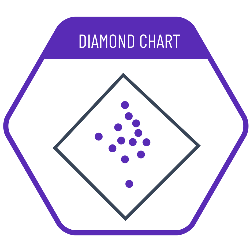
Diamond charts are used to visualize whether our data is in a good or bad state based on two parameters. In a typical scatter plot, when both parameters are positive, the top-right corner represents the best values and the bottom-left the worst. Therefore, we have to interpret the good-bad assessment diagonally. To make this interpretation easier, we rotate the chart 45 degrees counterclockwise to create a diamond chart, placing bad values at the bottom and good ones at the top.
VISUAL PERFORMANCE CHART
VISUAL CREATION PLATFORMS

Do you have any ideas or examples related to this graphic that you would like to see published here?
Share Here