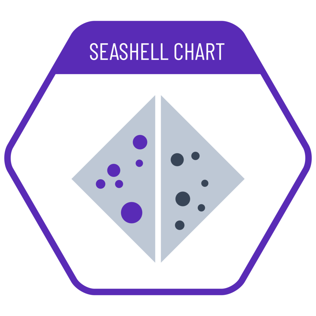
Seashell charts are used when we want to evaluate two scatter plots together. We compress one edge of each scatter plot to form a triangular shape, and place them side-by-side to jointly assess the data from two separate plots. First introduced on social media by a data analyst named Sezer Unar, this chart allows experts to examine a large amount of data simultaneously.
VISUAL PERFORMANCE CHART
VISUAL CREATION PLATFORMS

Do you have any ideas or examples related to this graphic that you would like to see published here?
Share Here