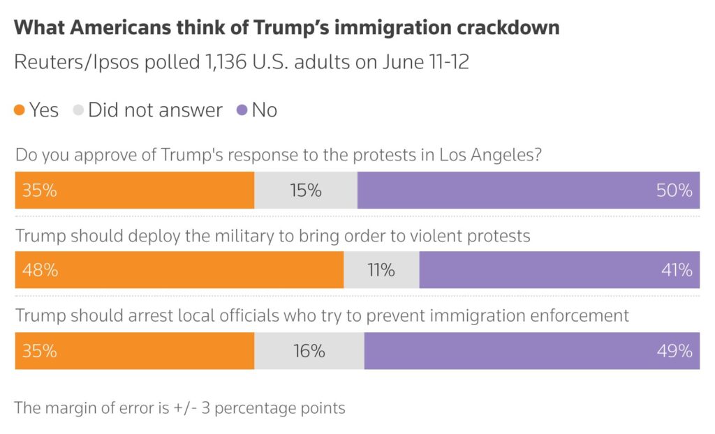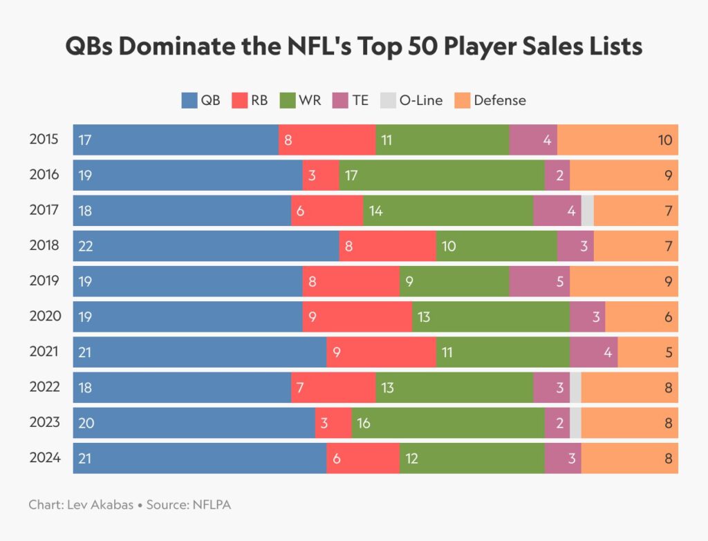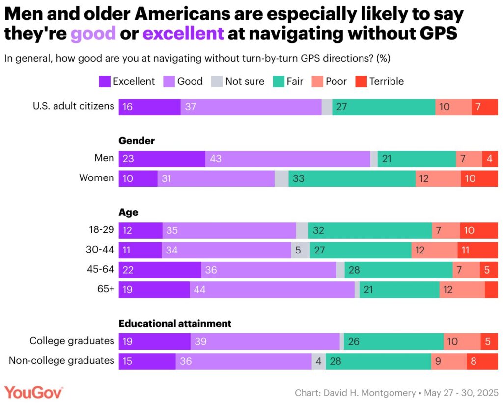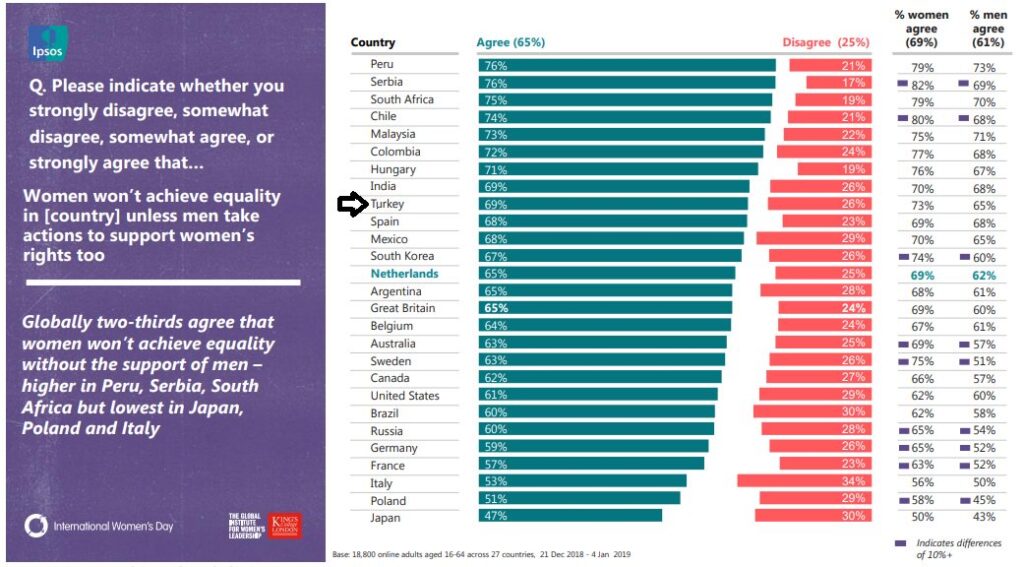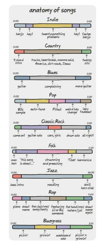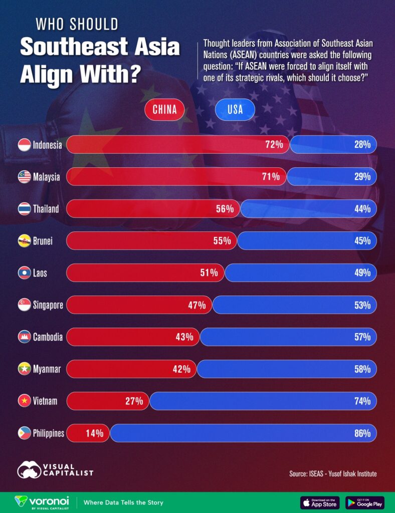
The cleanest visualization for comparing proportions within different wholes is the 100% stacked bar chart. While visual clutter may occur for datasets with many segments and while it is not suitable for time-series comparisons, it performs well when comparing datasets with no more than 4-5 segments across different categories. Since the total of all categories always equals 100%, visual comparison is possible not only for the data series on the left side, but also for the ones on the right side. Thus, the order of data series should be carefully considered.
VISUAL PERFORMANCE CHART
VISUAL CREATION PLATFORMS

SAMPLE IMAGES
Do you have any ideas or examples related to this graphic that you would like to see published here?
Share Here
