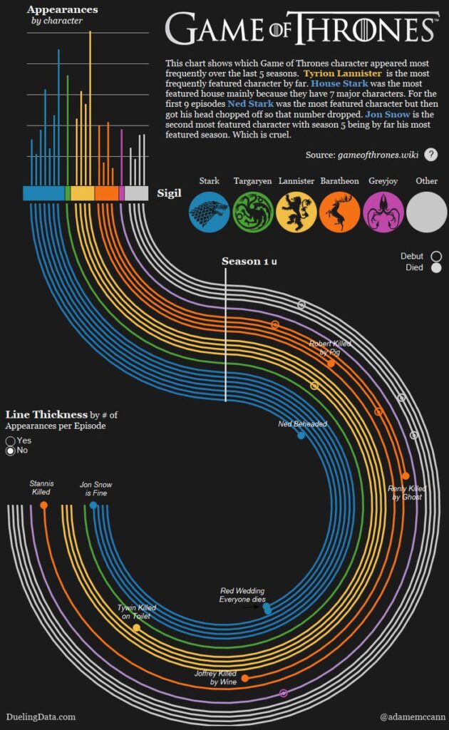
The radial bar chart is a unique visualization for comparing one segment of multiple wholes. It should be avoided when dealing with wholes with multiple segments as it can lead to visual clutter. To enhance readability, values should be ordered either from the inside out or from the outside in based on magnitude. A critical disadvantage of the radial bar chart is that it creates a hierarchical perception due to the changing sizes of nested wholes. For this reason, it can result in misinterpretation when comparing non-hierarchical wholes.
VISUAL PERFORMANCE CHART
VISUAL CREATION PLATFORMS

SAMPLE IMAGES
Do you have any ideas or examples related to this graphic that you would like to see published here?
Share Here