The best solution for visualizing datasets with many small parts is to prepare a treemap. Since it divides a rectangular whole into smaller rectangular parts, it provides enough space to place labels. If there are hierarchical categories, they can be grouped using colors, with areas are sorted first by top-level categories and then by subcategories. This makes it easier to interpret data based on value ranking.
VISUAL PERFORMANCE CHART
VISUAL CREATION PLATFORMS

SAMPLE VISUAL REVIEW
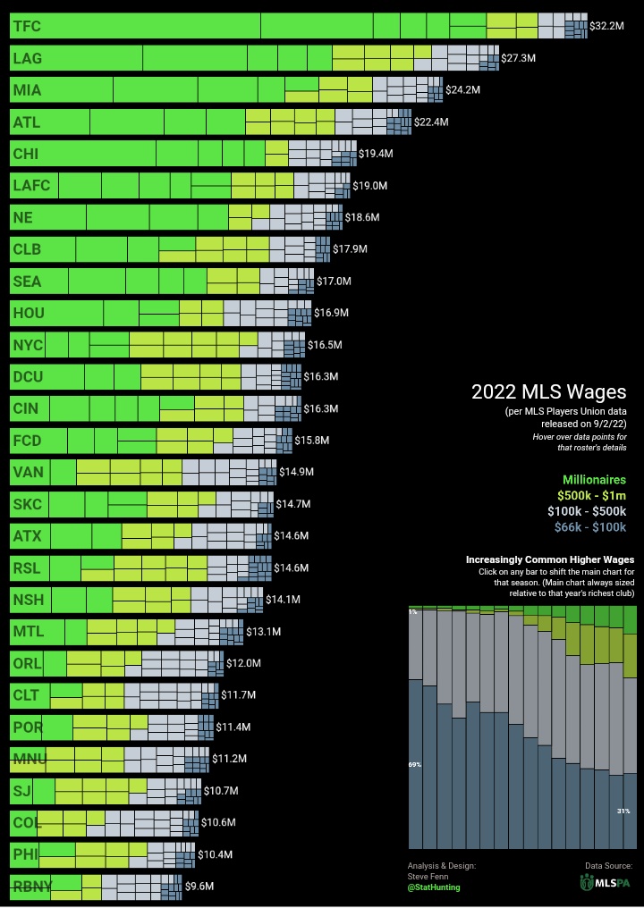
Actually, it would be more accurate to call this chart a multi-treemap chart rather than just a treemap. It leverages the core logic of treemaps—ending up with rectangular areas—to use those rectangles as bars in a bar chart. The data behind the treemaps represents the salaries paid by teams to their players. The coloring is designed using an emphasis-highlighting technique, which allows for easy comparison of the total salaries paid to the high-earning players being highlighted.
The reason for using treemaps instead of a traditional stacked bar chart here is to enhance the visibility of small-value segments. In a standard bar chart, only one dimension can vary (height or length), whereas treemaps provide two dimensions, allowing for clearer representation of tiny components.
SAMPLE IMAGES


Do you have any ideas or examples related to this graphic that you would like to see published here?
Share Here