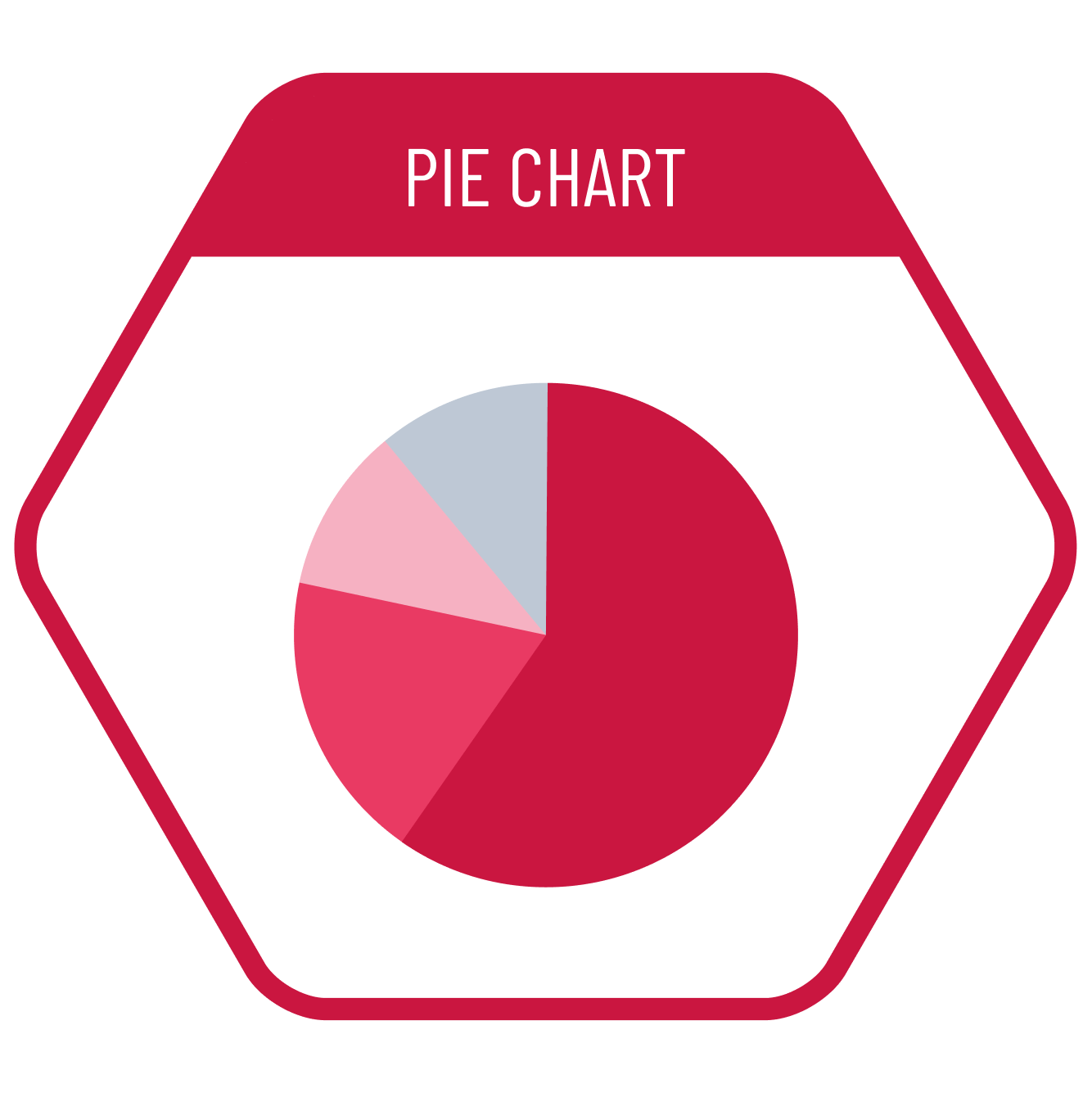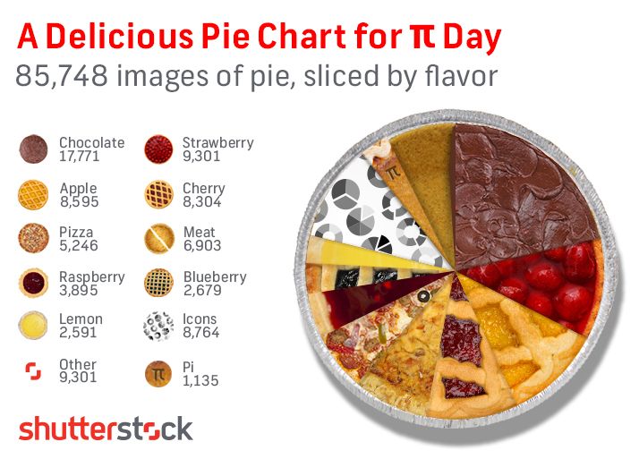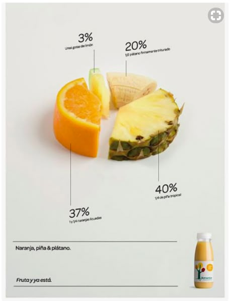
The pie chart is the most popular chart type in the Composition Class. However, despite its popularity, the most accurate statement we can make about pie charts is: ”We should avoid using them.’ This is because the comparison in these charts is based on slice angles, and our brains are not very successful at comparing angles. However, since the concept of dividing a pie is intuitive for general audiences, it can be used for comparisons of part-to-whole ratios when the differences between values are distinct, and the dataset contains no more than 4-5 categories.
VISUAL PERFORMANCE CHART
VISUAL CREATION PLATFORMS

SAMPLE IMAGES
Do you have any ideas or examples related to this graphic that you would like to see published here?
Share Here
