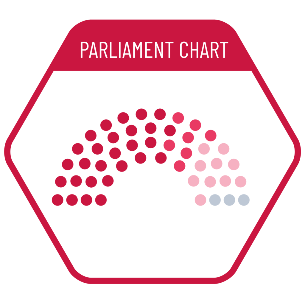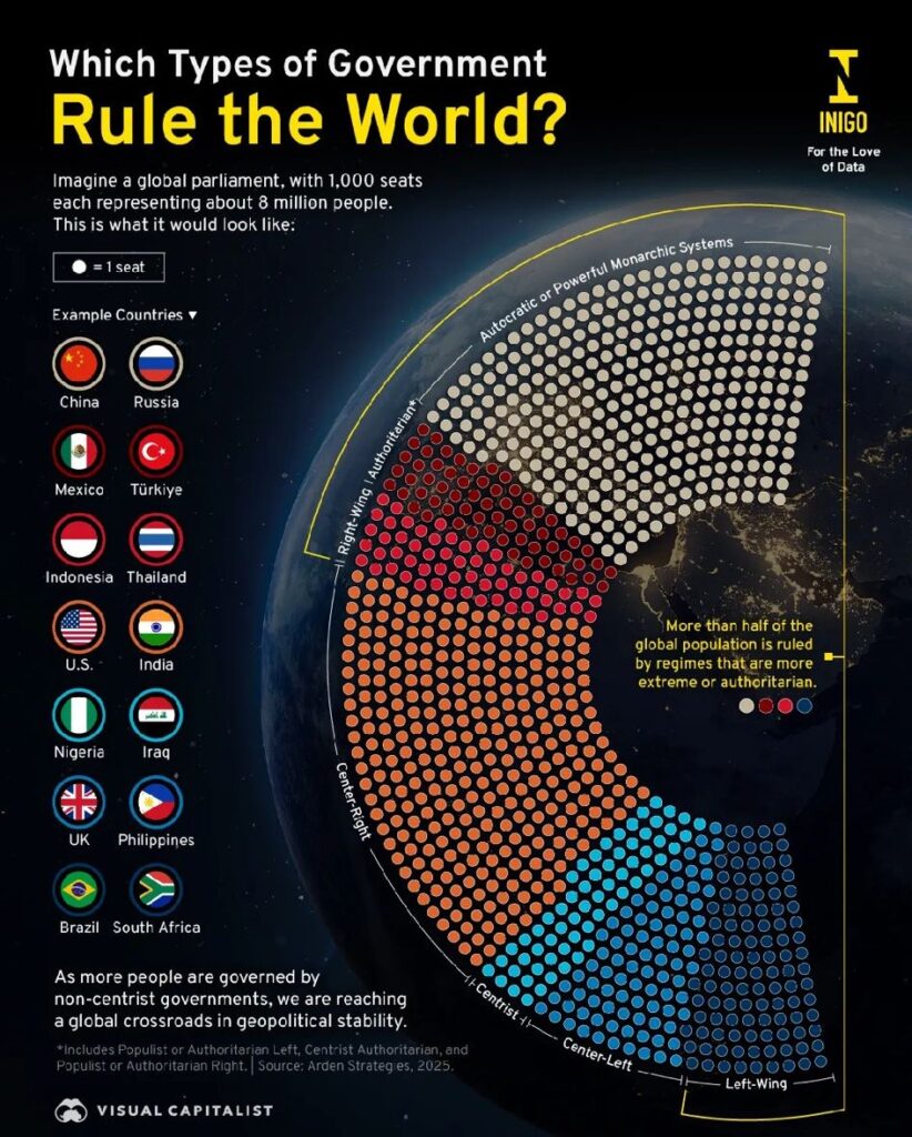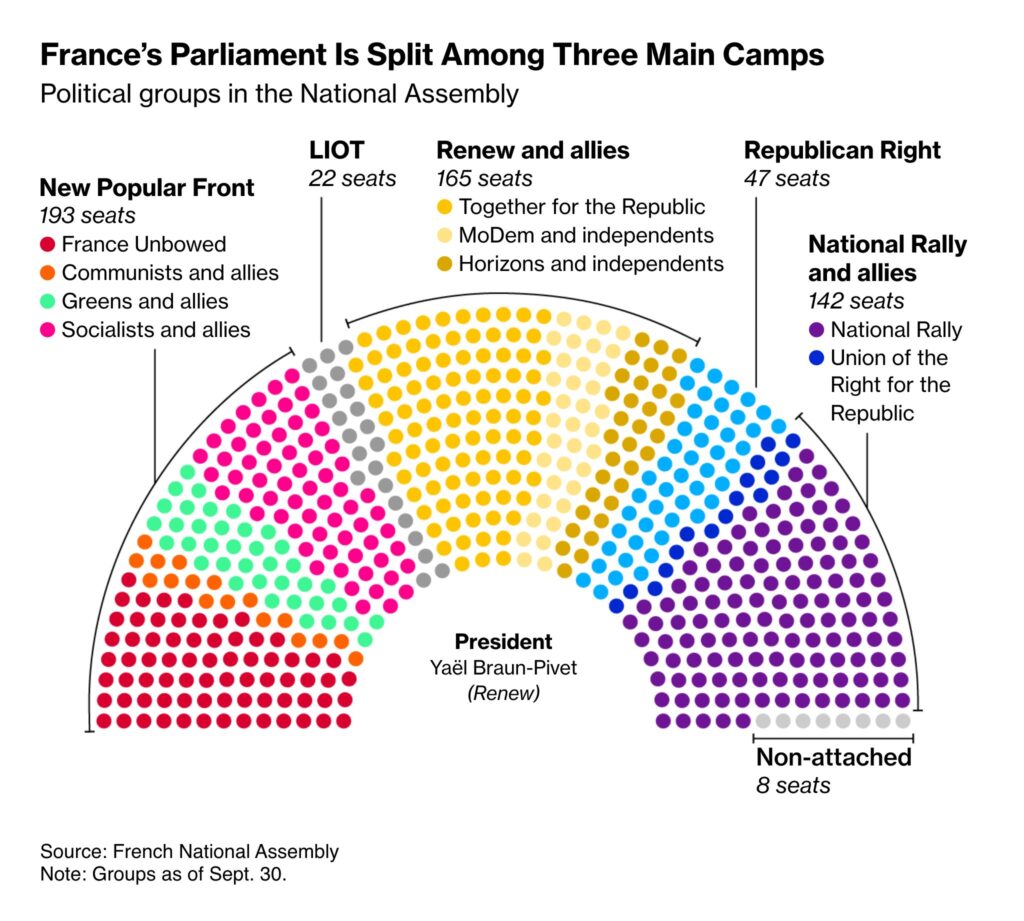
One of the visualizations that is close to real-world scenarios is the parliament chart. It illustrates seat distributions in parliaments based on the number of representatives won by each party. This chart can be considered a curved version of a waffle chart. Although it does not provide an easy visual value comparison, it effectively conveys the overall situation, particularly in identifying majorities.
VISUAL PERFORMANCE CHART
VISUAL CREATION PLATFORMS

SAMPLE IMAGES
Do you have any ideas or examples related to this graphic that you would like to see published here?
Share Here
