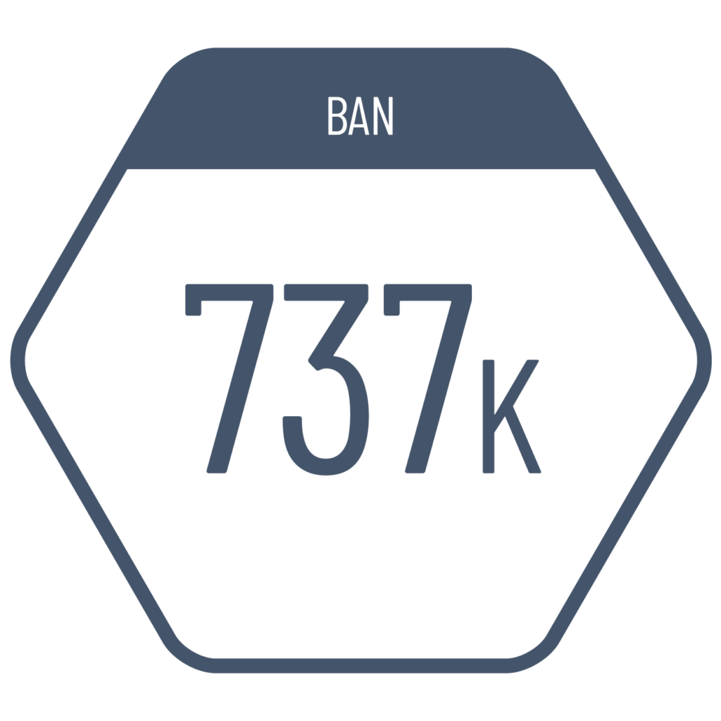
When we want to visualize a single value rather than an entire dataset, traditional charts are not suitable. In such cases, we can use large-font numbers (BANs: Big Ass Numbers) to present the data visually. To help the reader interpret the value, it’s best not to display the BAN in isolation—rather, it should be accompanied by a reference point, such as a target, past or future value, competitor, subcategory, or parent group. Additionally, icons with color coding and border indicators can make the value easier and quicker to interpret. This approach is especially common in KPI displays on dashboards.
VISUAL PERFORMANCE CHART
VISUAL CREATION PLATFORMS

Do you have any ideas or examples related to this graphic that you would like to see published here?
Share Here