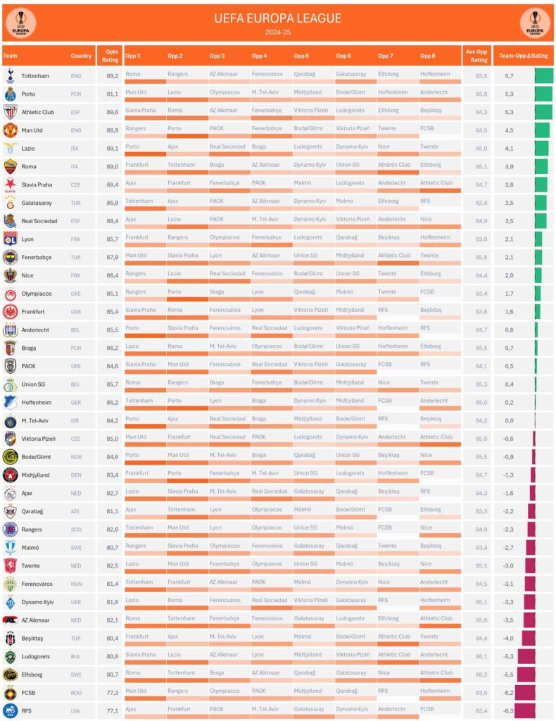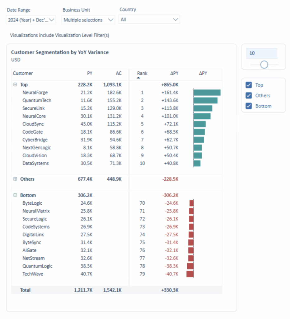
When we want to visually support value comparisons in table columns containing important data, we can use the data bars method. In this approach, the size of each value in a given column is represented by a bar displayed within the cell. There are two common ways to implement this: placing the bar behind the numeric value in the same column or displaying it in a separate adjacent column. If the bar is placed behind the value, pastel colors should be used to maintain readability; if it’s placed next to the value, more saturated colors are recommended.
VISUAL PERFORMANCE CHART
VISUAL CREATION PLATFORMS

SAMPLE IMAGES
Do you have any ideas or examples related to this graphic that you would like to see published here?
Share Here


