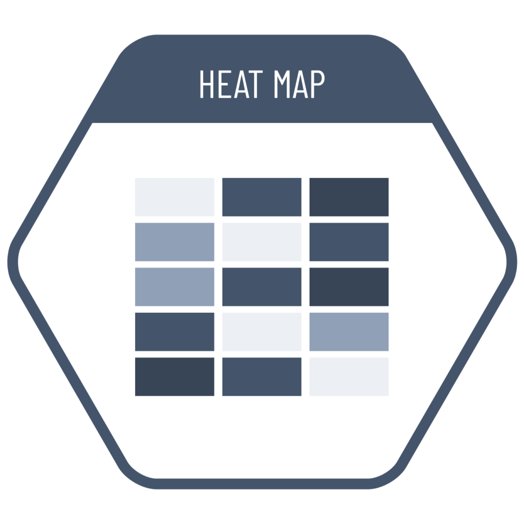
In comparisons involving two different dimensions or multiple datasets within a categorical breakdown, instead of having the reader evaluate by reading each value individually, we can use heatmaps to visually convey magnitude through color intensity. For example, in correlation matrices where we analyze the relationships between many variables, heatmaps can display the direction of the correlation using color and the strength using the depth of that color, enabling quick interpretation of the entire table. They can also be effectively used to evaluate temporal changes at a glance.
VISUAL PERFORMANCE CHART
VISUAL CREATION PLATFORMS

SAMPLE IMAGES


Do you have any ideas or examples related to this graphic that you would like to see published here?
Share Here