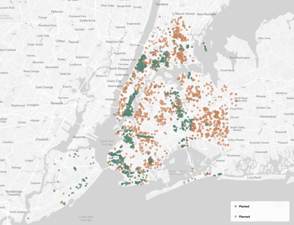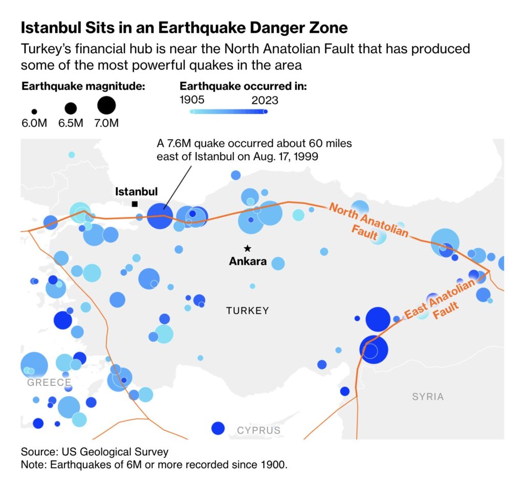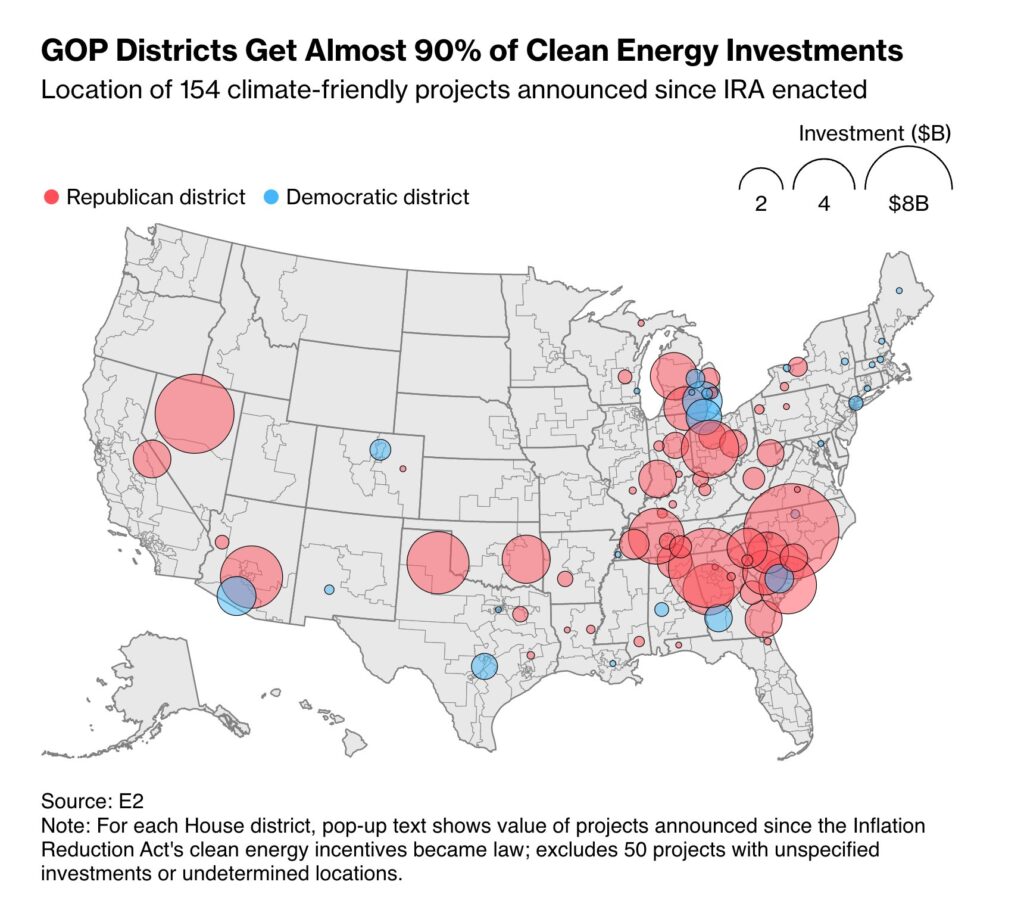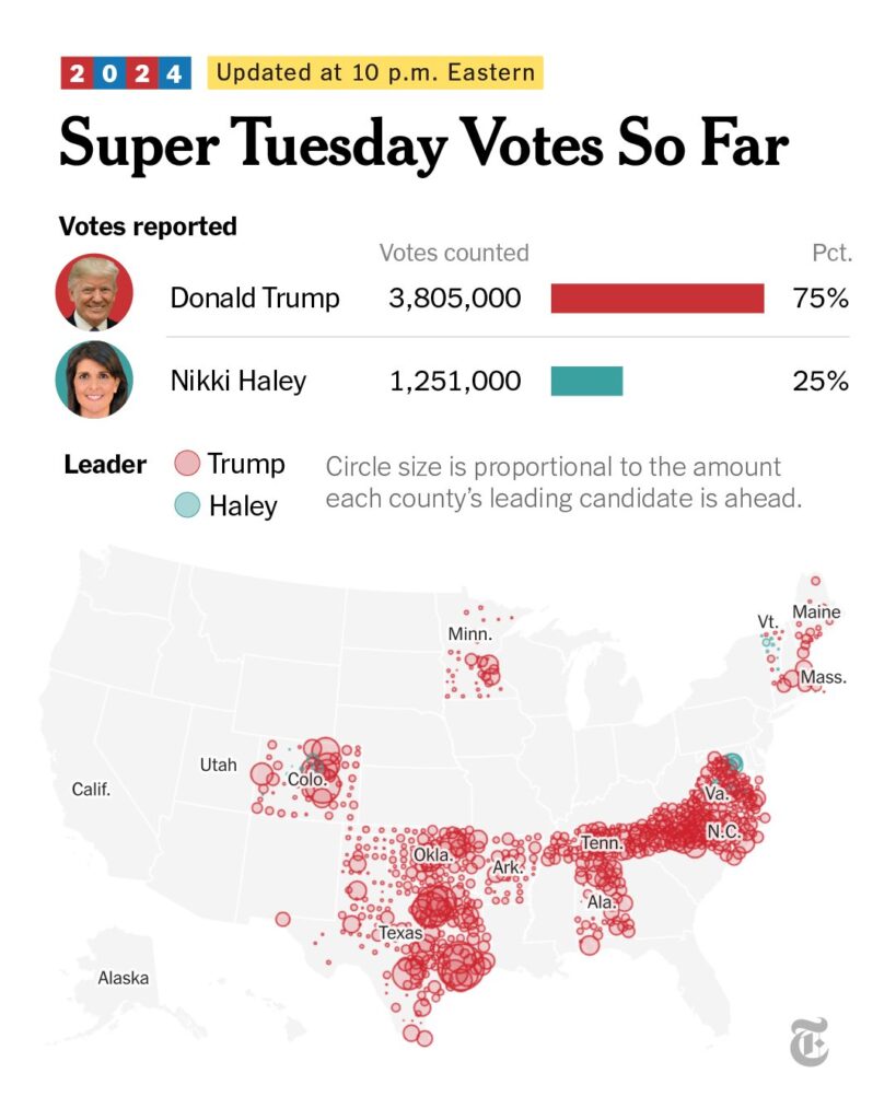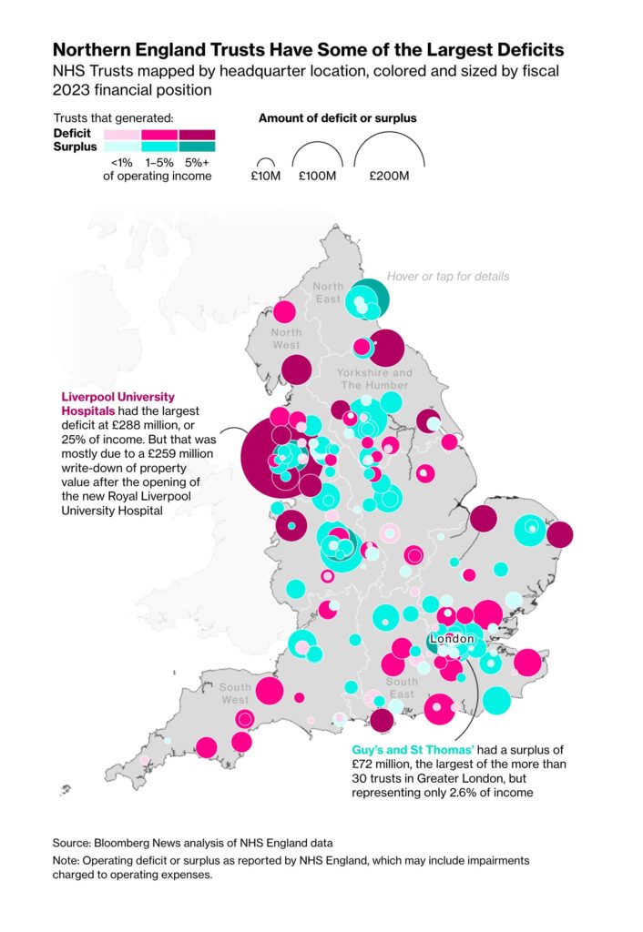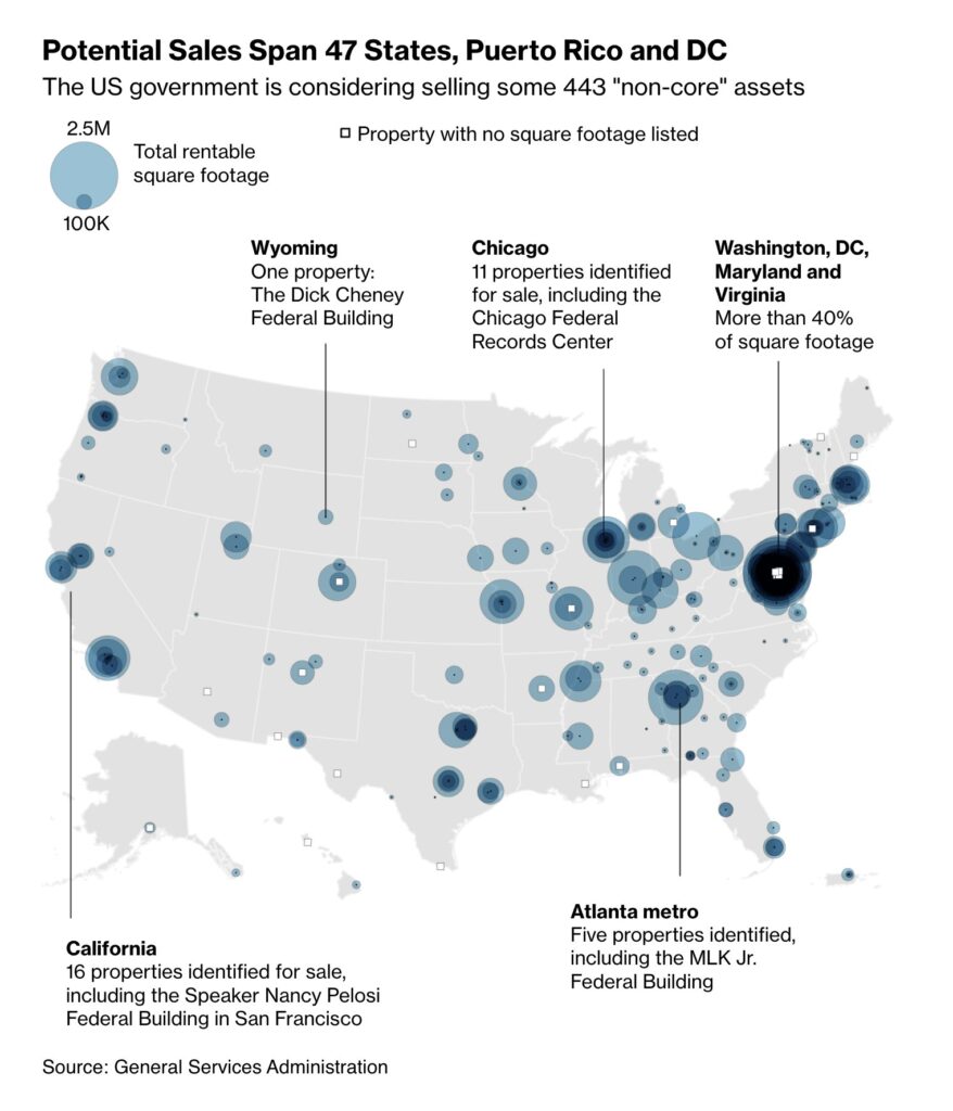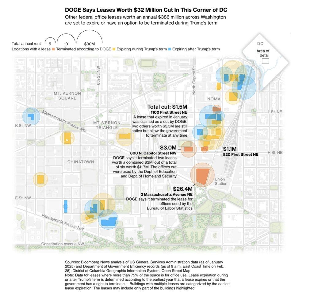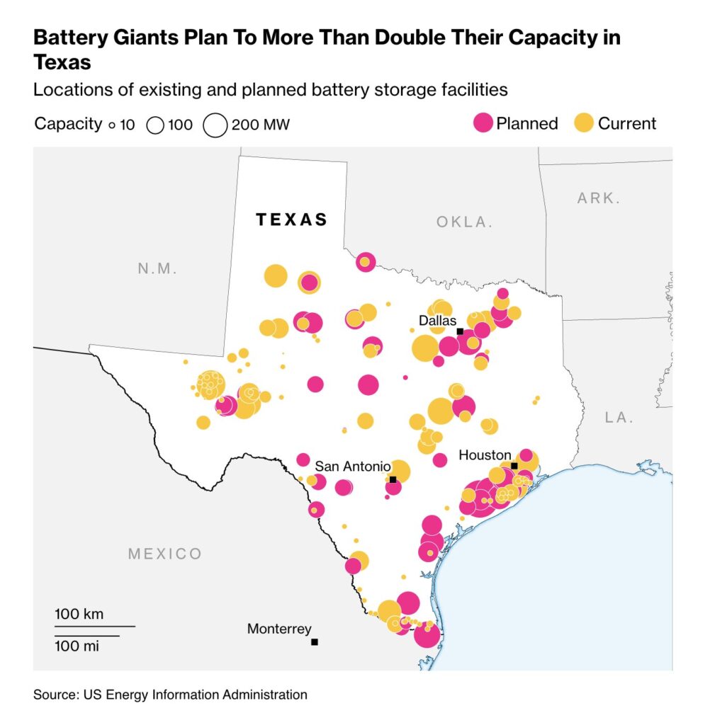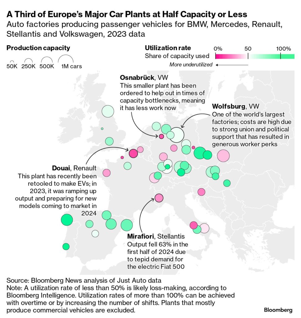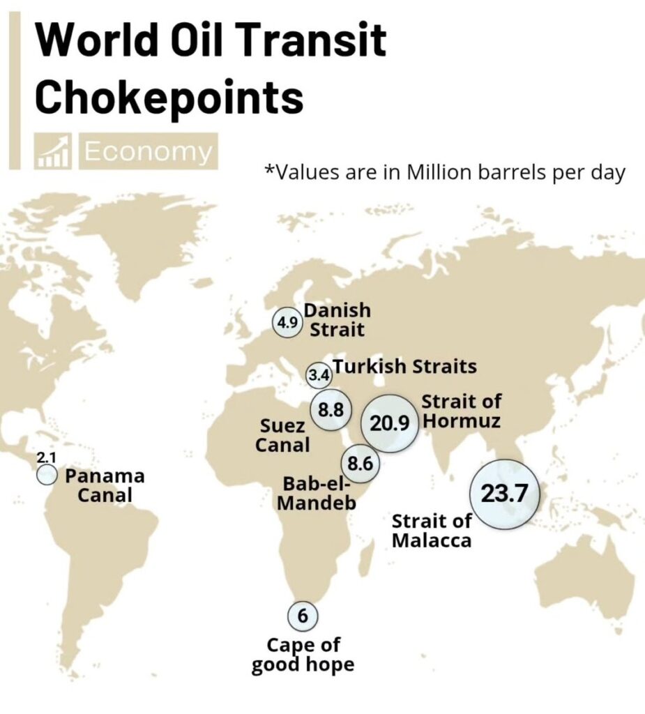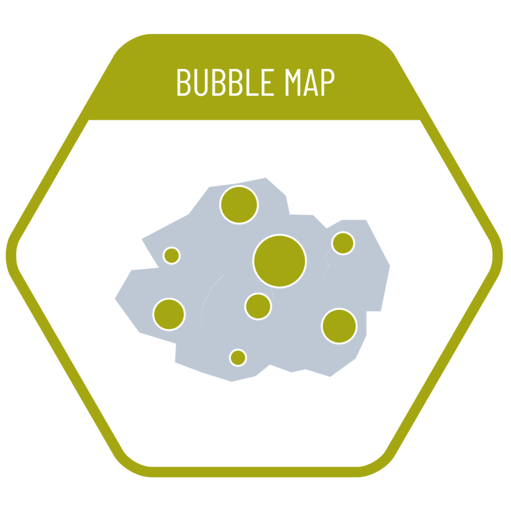
Maps that visualize the magnitude of values at specific locations using circles (bubbles) are called bubble maps. One common challenge with bubble maps is the overlapping of circles when data values are large. To address this, all circles can be scaled down proportionally, or transparency can be applied to make overlaps more readable. Additionally, colors or different shapes can be used to classify or distinguish between categories of data.
VISUAL PERFORMANCE CHART
VISUAL CREATION PLATFORMS

SAMPLE IMAGES
Do you have any ideas or examples related to this graphic that you would like to see published here?
Share Here