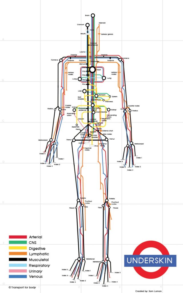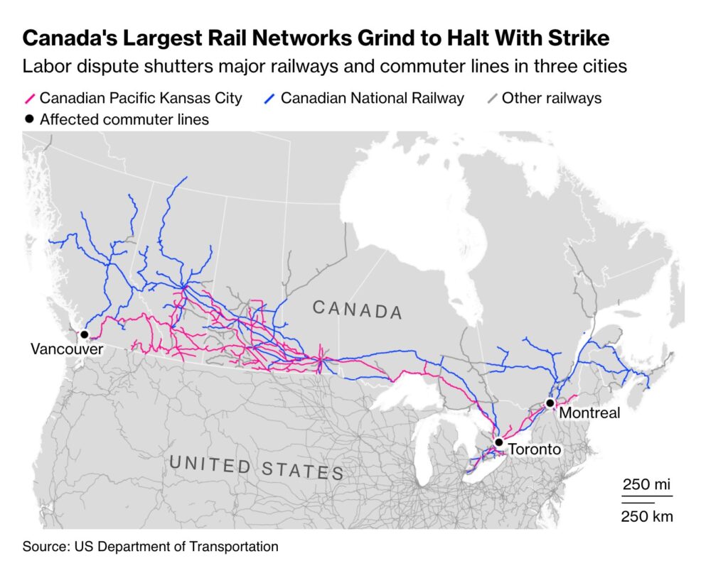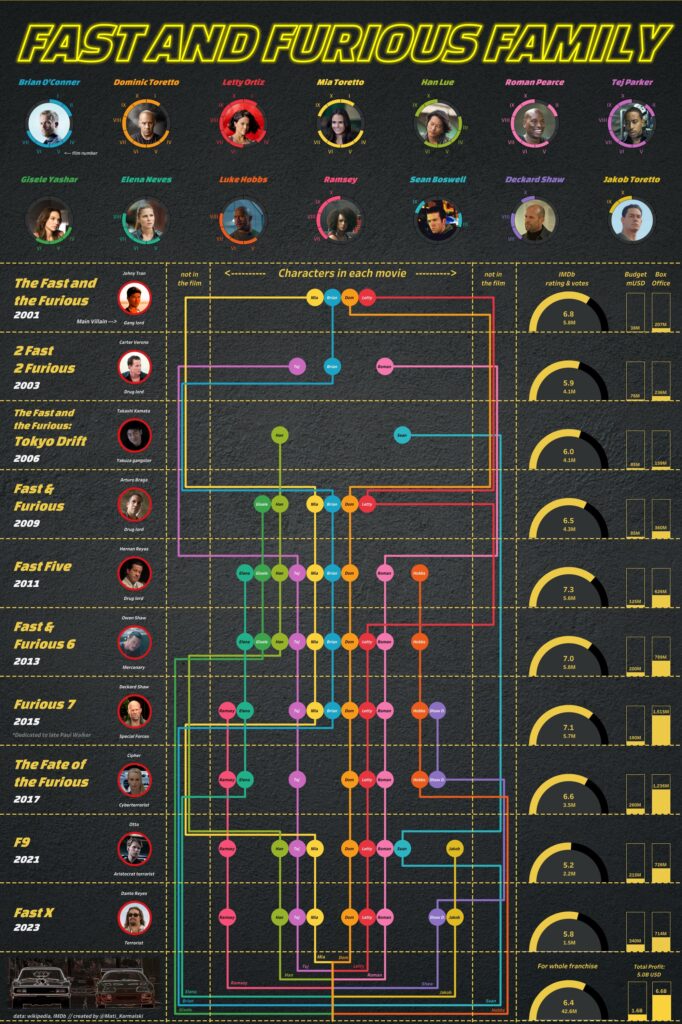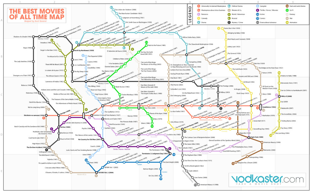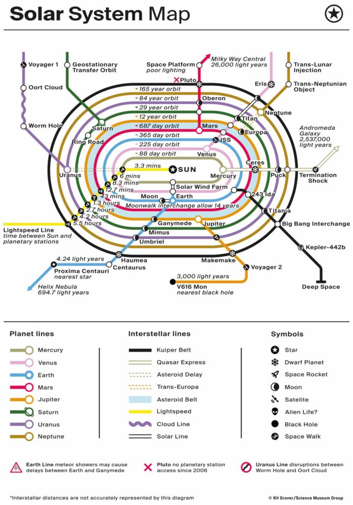
In the early 20th century, the London Underground Map, designed by Harry Beck, evolved into a standard format used worldwide to represent metro systems. Over time, this format also began to be used to illustrate the relationships between interconnected series of data. These visualizations, which aim to preserve the relative positions of lines while showing their interrelations, are called transit maps. To maintain clarity, the background is simplified by replacing the city’s actual map with a schematic silhouette, allowing stations to be positioned along straight lines and spaced evenly.
VISUAL PERFORMANCE CHART
VISUAL CREATION PLATFORMS

SAMPLE IMAGES
Do you have any ideas or examples related to this graphic that you would like to see published here?
Share Here