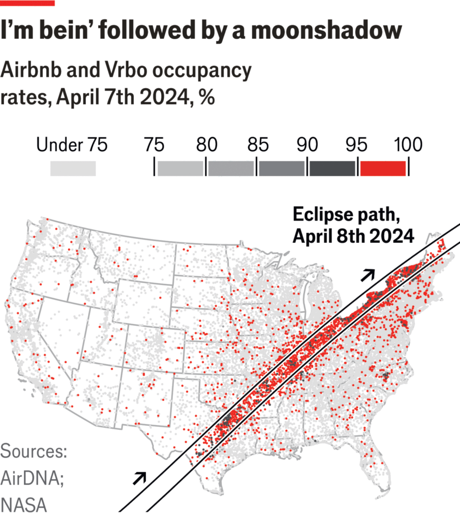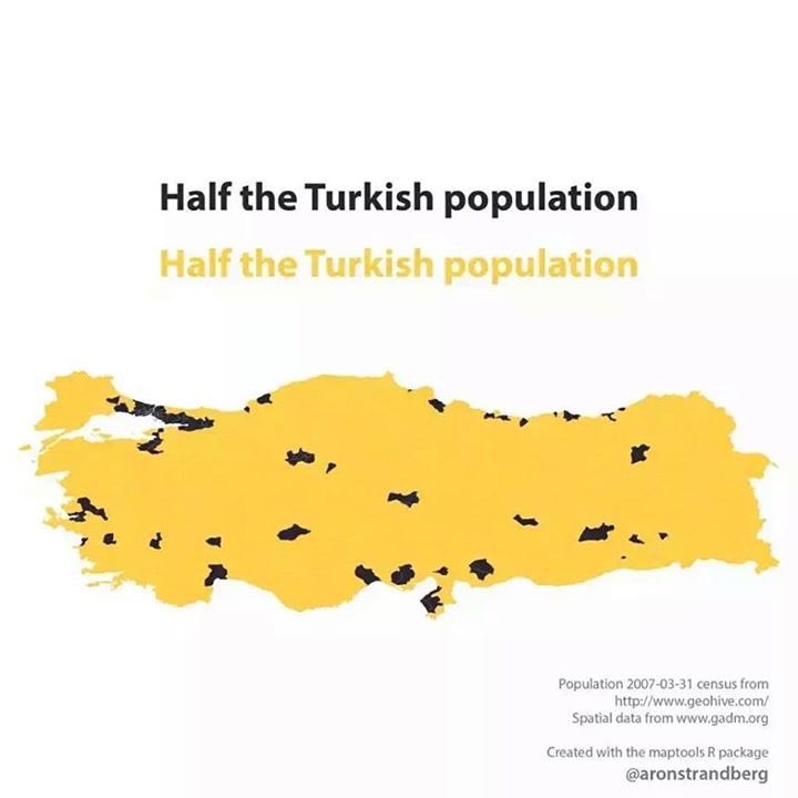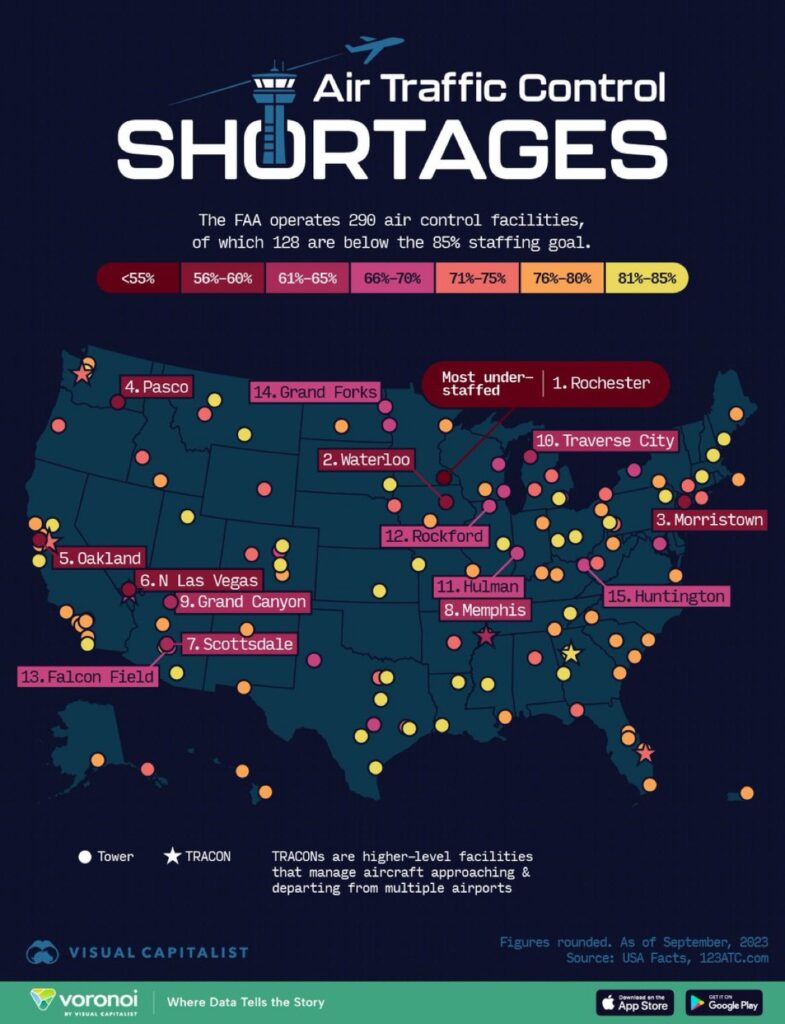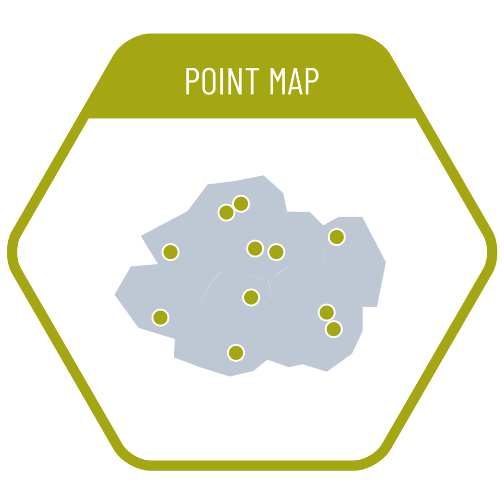
Charts that visualize the individual positions of data points on a map are called point maps. They make it possible to observe how data is distributed geographically—where concentrations or sparse areas occur. However, when many data points share the same or very close locations, they tend to overlap, making them difficult to distinguish. To improve readability, adding transparency to the points can help make overlapping patterns more visible.
VISUAL PERFORMANCE CHART
VISUAL CREATION PLATFORMS

SAMPLE IMAGES
Do you have any ideas or examples related to this graphic that you would like to see published here?
Share Here