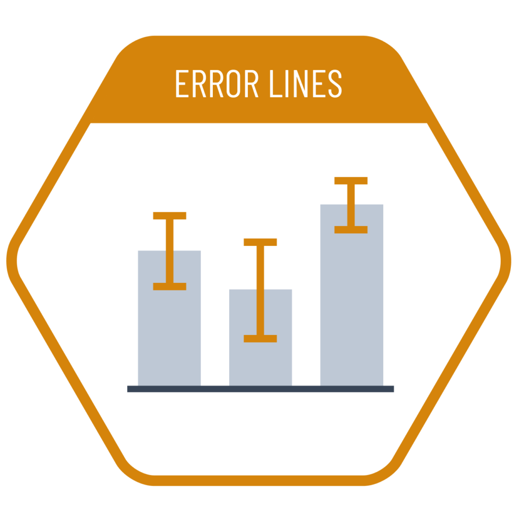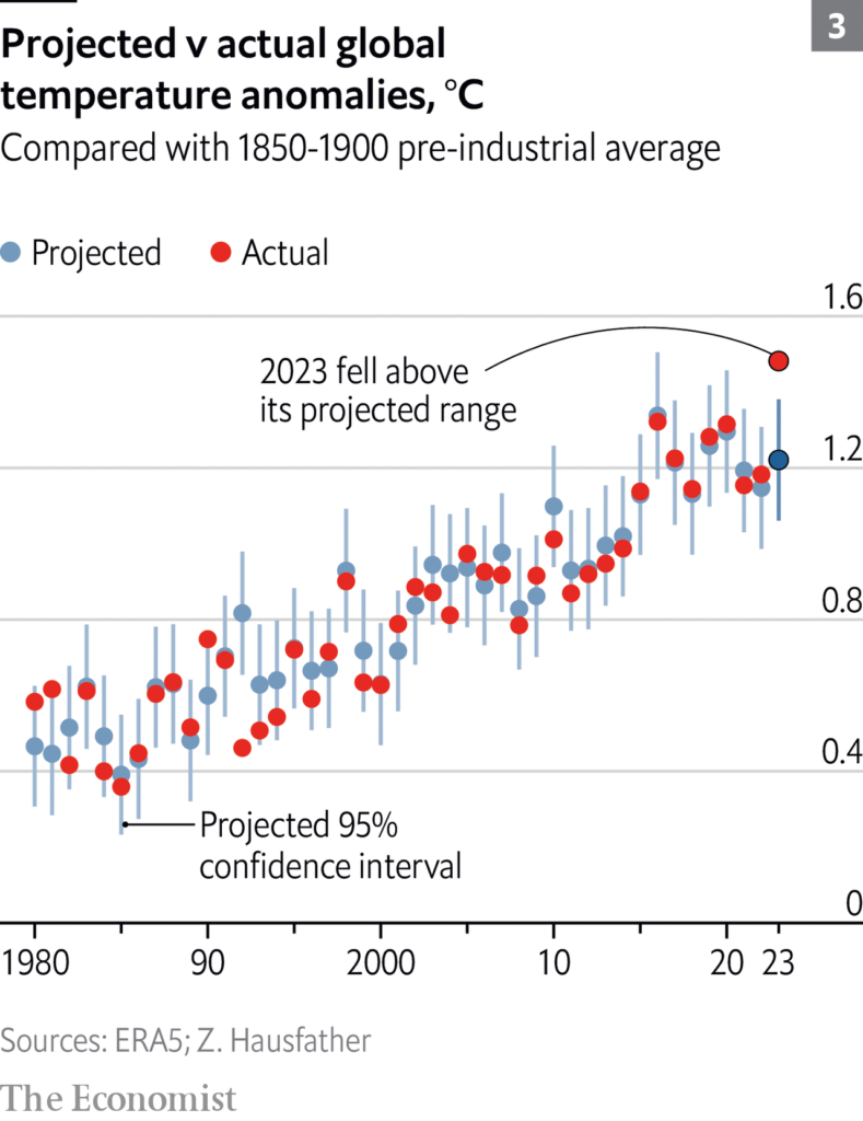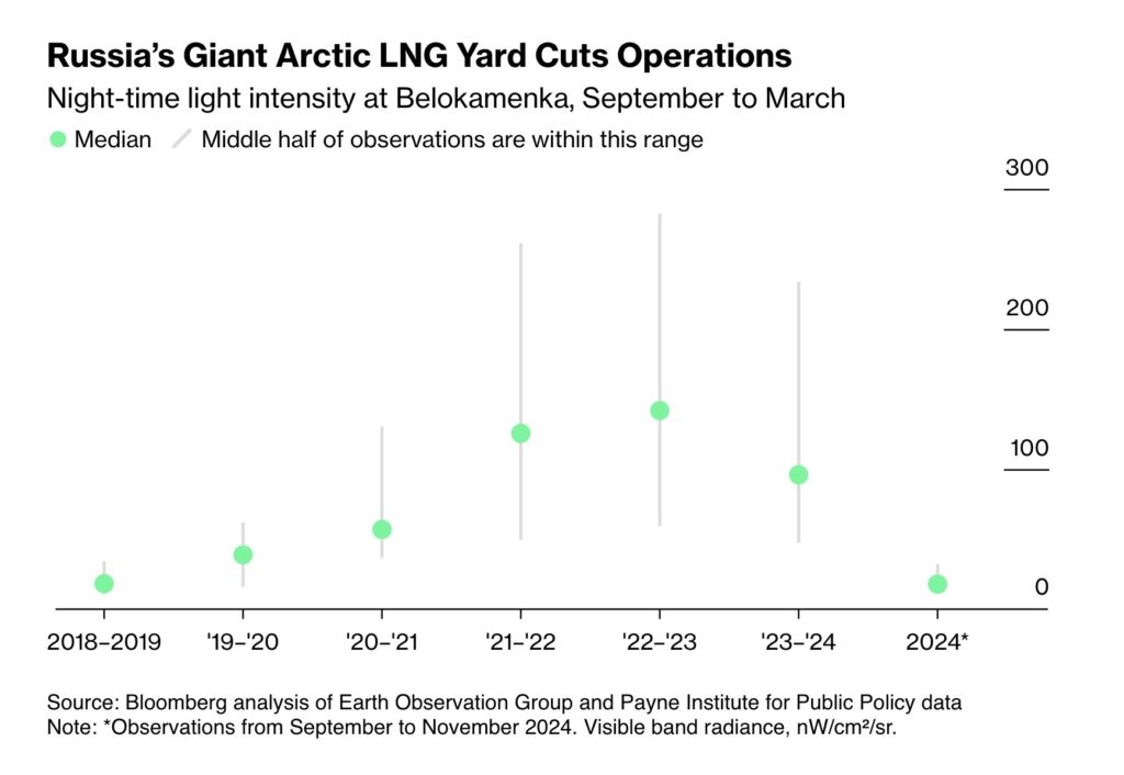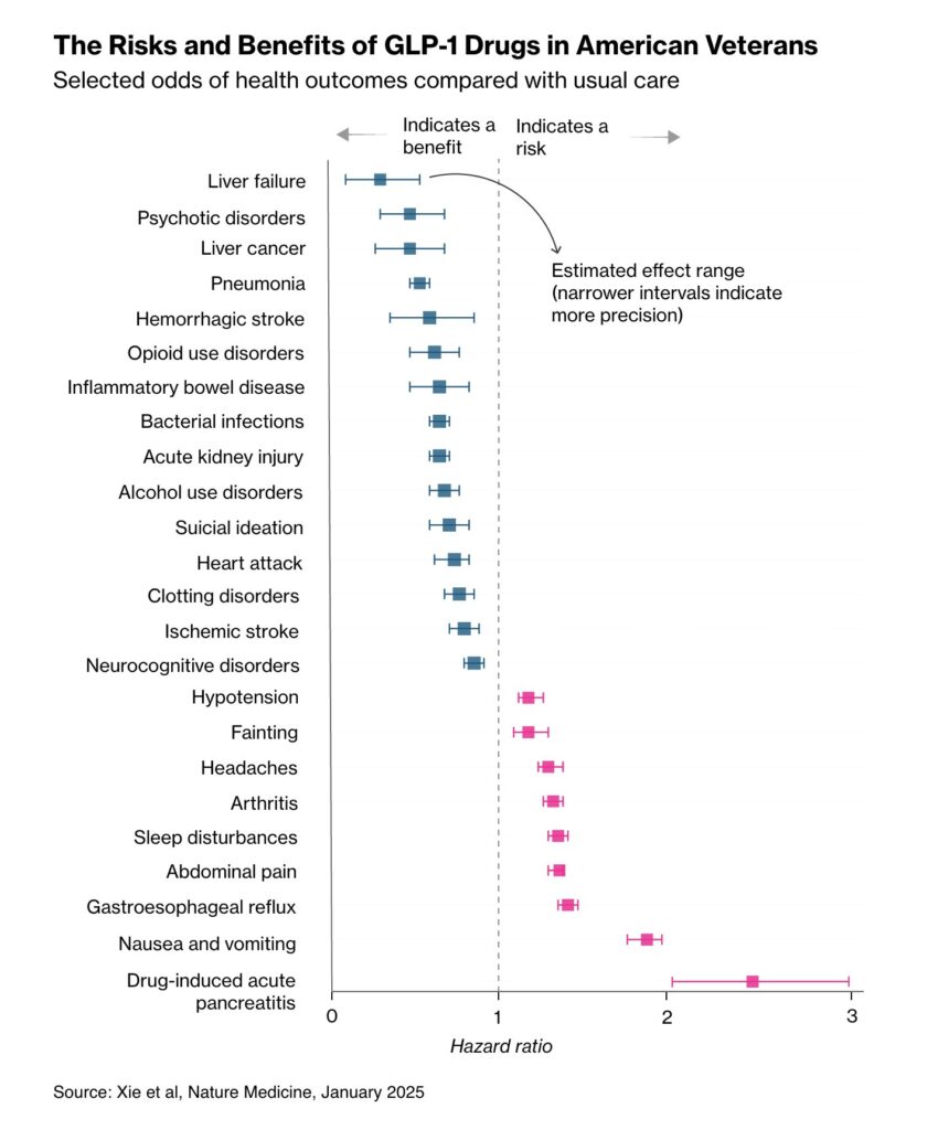
When comparing the means of our data is more important, and we also want to communicate the uncertainty around those values, error bars can be an effective solution. This method can be used in various chart types—such as a column chart comparing the means of different categories, a line chart showing changes in average values over time, or a scatterplot visualizing the means of two parameters. The error bar, typically added to the end of the column or data point, usually represents the standard deviation or confidence interval around the mean.
VISUAL PERFORMANCE CHART
VISUAL CREATION PLATFORMS

SAMPLE IMAGES
Do you have any ideas or examples related to this graphic that you would like to see published here?
Share Here

