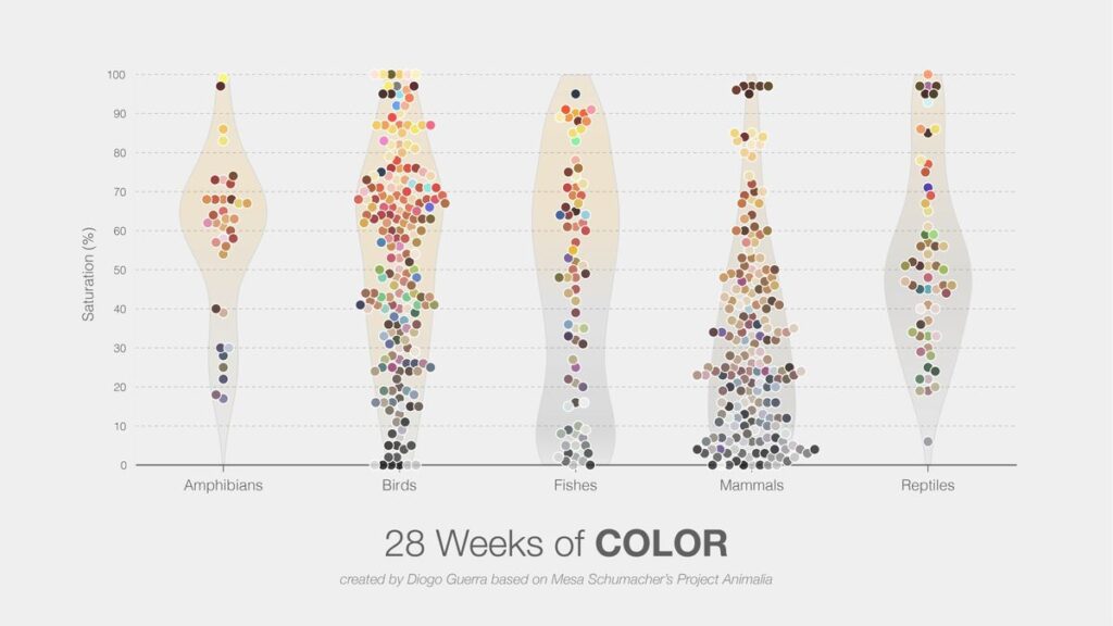
Violin charts are used to visualize the distribution density of a dataset by representing the likelihood of data occurrences through symmetrical area shapes on both sides of a central axis. In addition to this distinctive form, violin charts can incorporate other visual elements. Data points can be overlaid using dot plots or jitter plots, the median and 95% data range can be shown with boxes and lines, and quartile markers can also be included. For comparing two different distributions, the violin shape can even be split and mirrored along a shared center line.
VISUAL PERFORMANCE CHART
VISUAL CREATION PLATFORMS

SAMPLE IMAGES
Do you have any ideas or examples related to this graphic that you would like to see published here?
Share Here