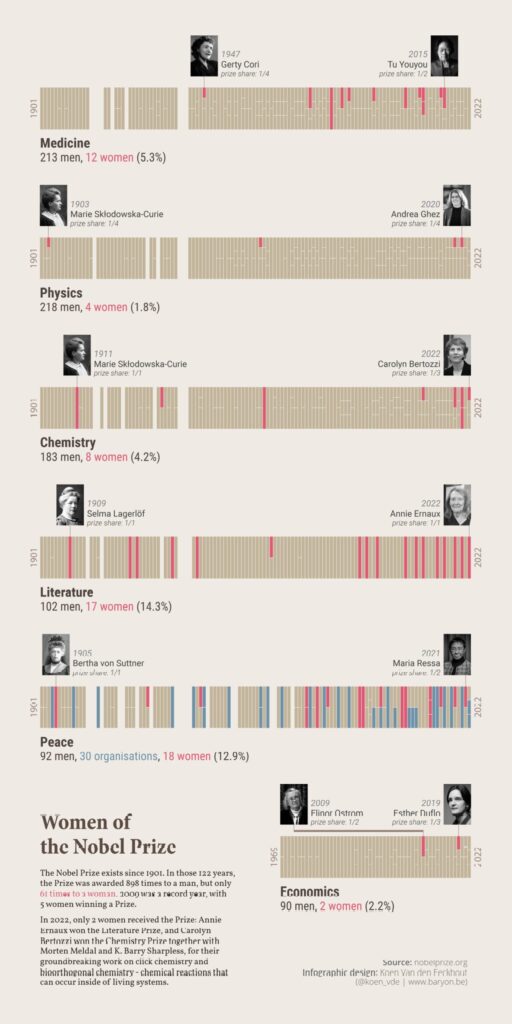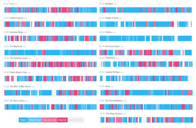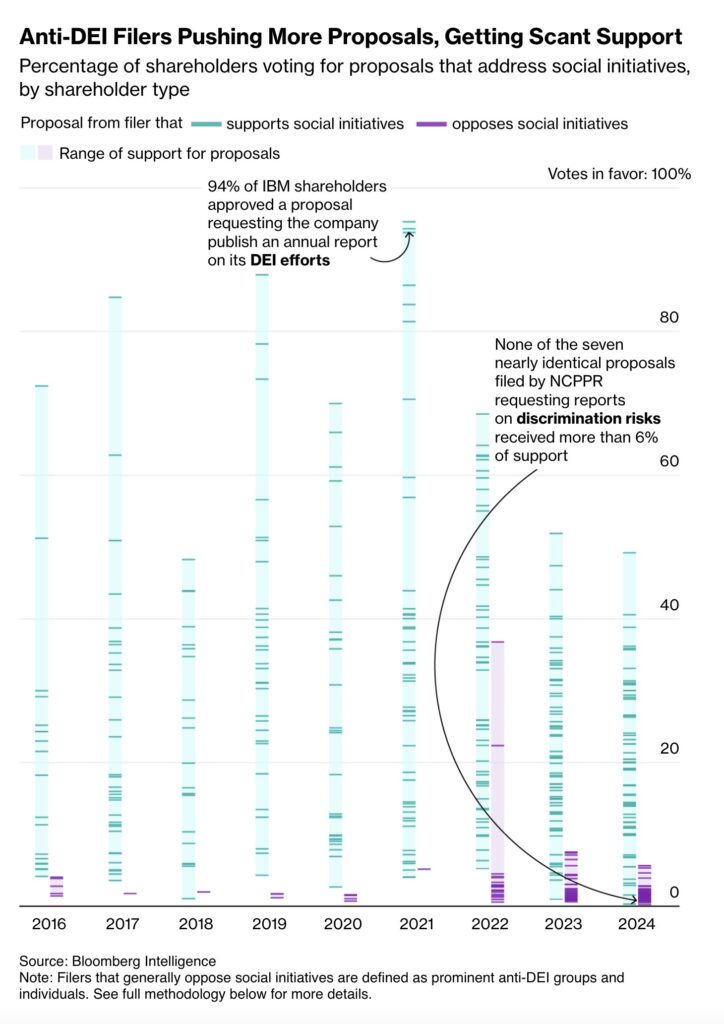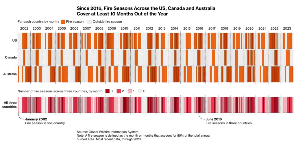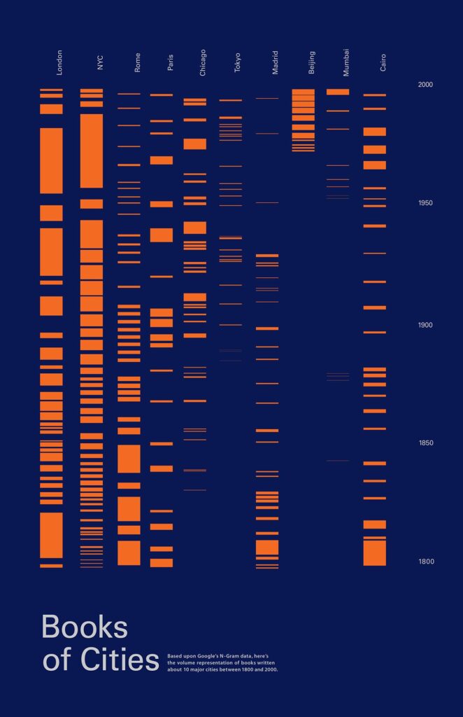
Barcode charts are used to show the value ranges of data divided into categories. When lines are used instead of dots to represent each data point—as in a dot plot—the visual begins to resemble a barcode, which is how this chart type got its name. While it is not possible to determine the exact count of values that are the same, barcode charts provide a very simple way to reveal the distribution range and density of the data. Although outliers are not explicitly visualized, special data points can easily be highlighted using color.
VISUAL PERFORMANCE CHART
VISUAL CREATION PLATFORMS

SAMPLE IMAGES
Do you have any ideas or examples related to this graphic that you would like to see published here?
Share Here