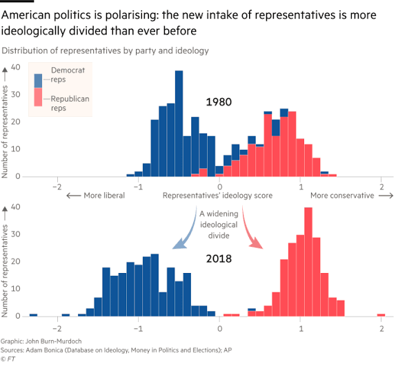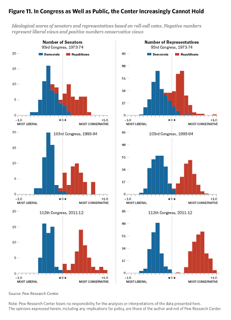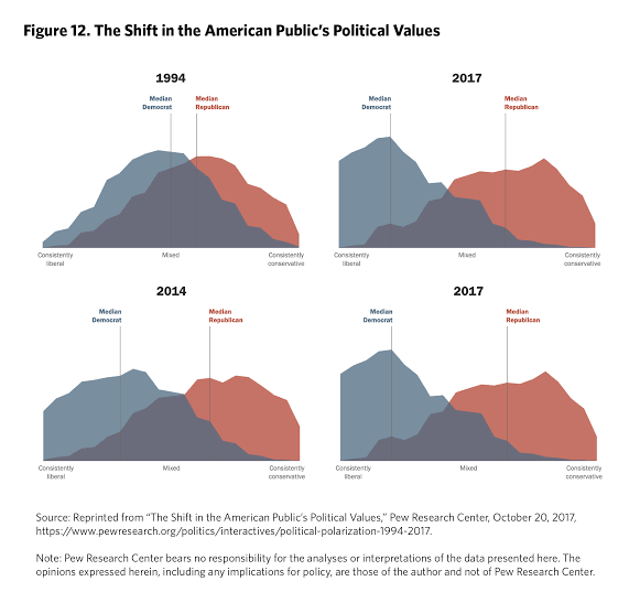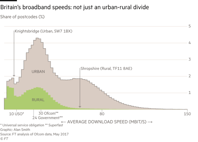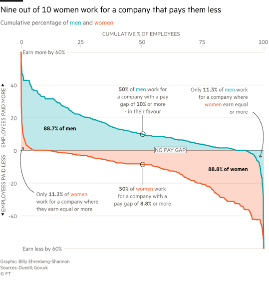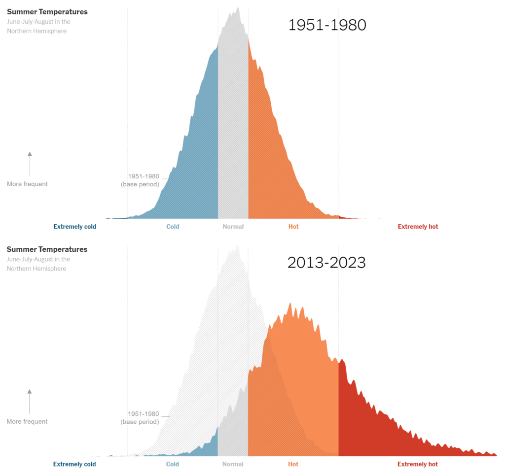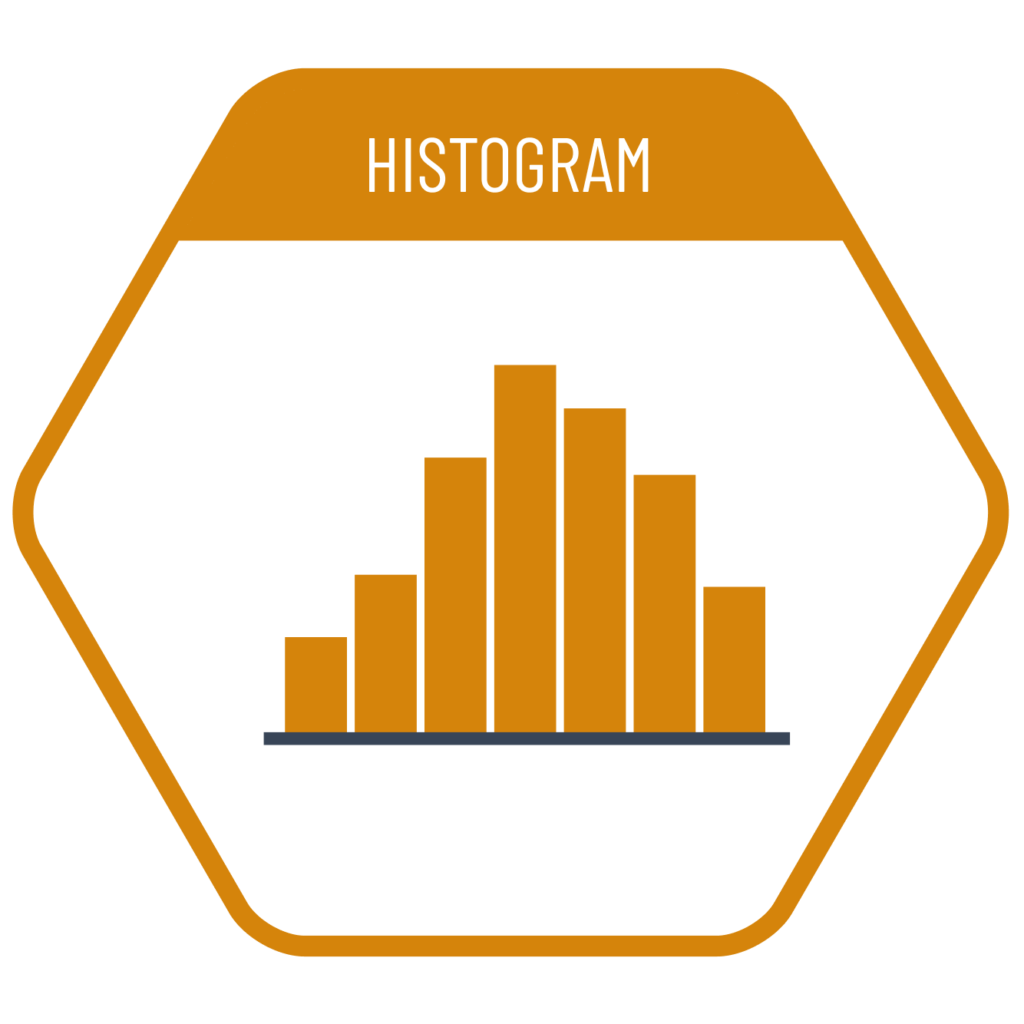
In datasets where we want to visualize the distribution of values, placing each data point according to its exact value—especially when decimal values are involved—can result in a very scattered layout. To simplify this, histograms do not display each individual value at its exact position. Instead, they divide the entire value range into equal, rounded intervals (bins) and show how many data points fall within each interval. Since there is no single rule for determining the number or size of these intervals, the same dataset can be visualized in different ways. The person creating the chart selects the version that best fits their needs.
VISUAL PERFORMANCE CHART
VISUAL CREATION PLATFORMS

SAMPLE IMAGES
Do you have any ideas or examples related to this graphic that you would like to see published here?
Share Here