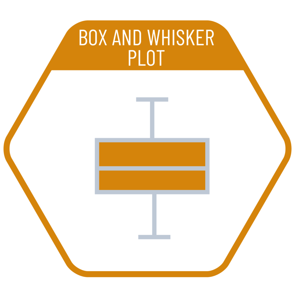
Box and whisker plots are a statistical graphing method used to visualize the distribution and summary of a dataset. The box in the chart represents the middle 50% of the data, while the lines extending above and below (the “whiskers”) indicate the remaining quartiles. The line inside the box shows the median, and an “x” mark may be used to indicate the arithmetic mean. Since individual data points are not displayed, it does not provide direct insight into data density; however, it is particularly useful for identifying outliers represented as individual points.
VISUAL PERFORMANCE CHART
VISUAL CREATION PLATFORMS

Do you have any ideas or examples related to this graphic that you would like to see published here?
Share Here