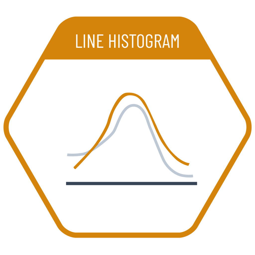
In a dataset with a categorical breakdown where we want to examine the distribution—not of the total, but within each category individually and in comparison to one another—a line histogram can be used. However, there is a risk of confusion with density plots. Line histograms display a line that connects the top points of the bars in a traditional histogram, whereas density plots estimate and smooth the distribution across all continuous x-values, resulting in a flowing curve.
VISUAL PERFORMANCE CHART
VISUAL CREATION PLATFORMS

Do you have any ideas or examples related to this graphic that you would like to see published here?
Share Here