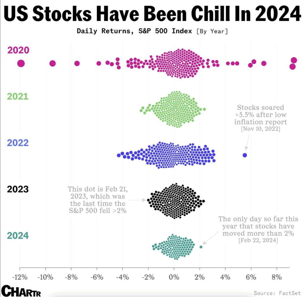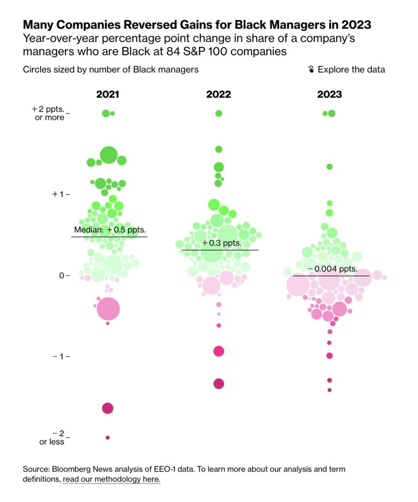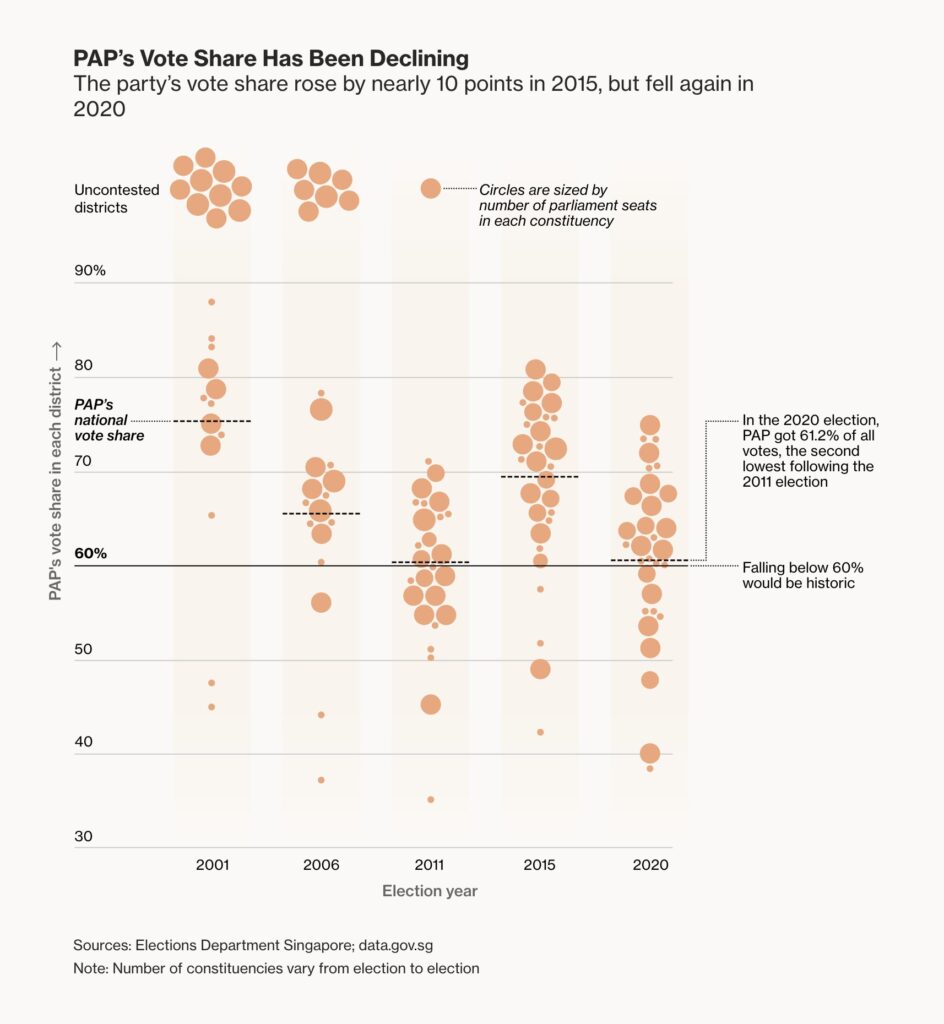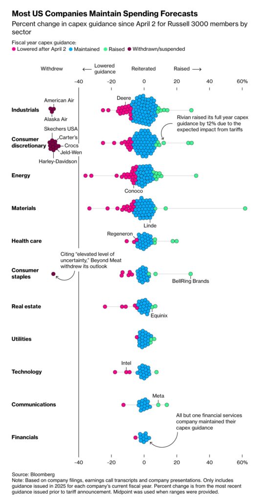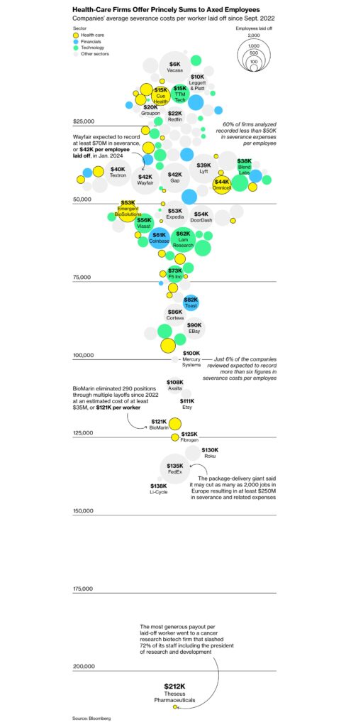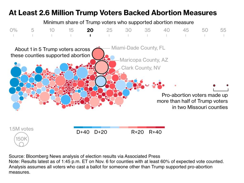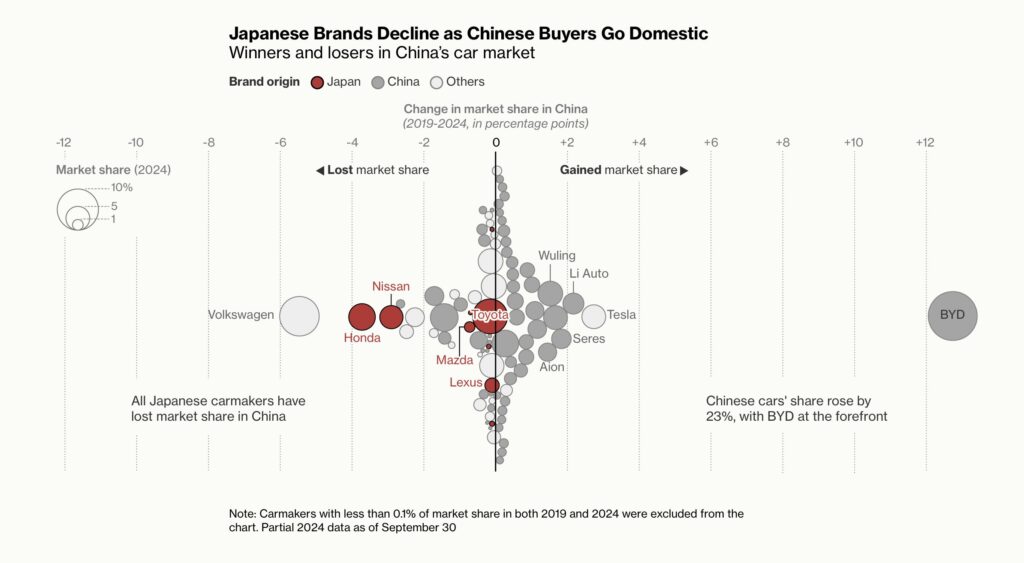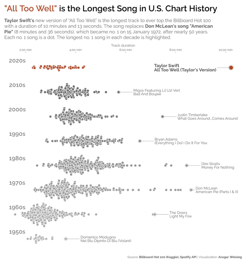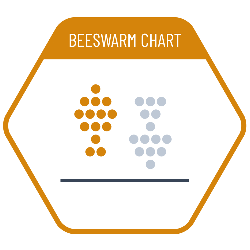
Many charts used to visualize data distributions are designed for datasets with a high number of values and rely on visual elements such as circle area or bar length to convey density. However, if the dataset contains only a small number of values, these aggregated representations lose their effectiveness. In such cases, a beeswarm chart, which displays each data point individually according to its exact value, provides a better solution for visualizing the distribution.
VISUAL PERFORMANCE CHART
VISUAL CREATION PLATFORMS

SAMPLE IMAGES
Do you have any ideas or examples related to this graphic that you would like to see published here?
Share Here