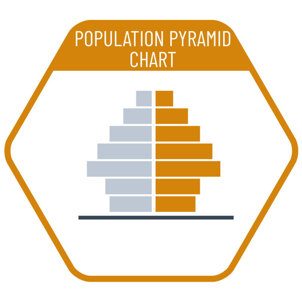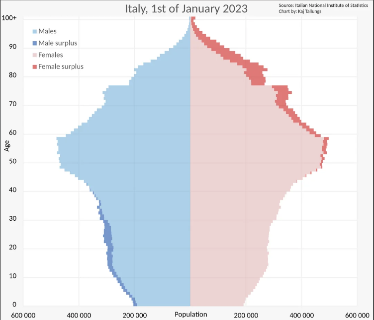
Population pyramids are a type of chart used to visually compare the distributions of two datasets side by side. The chart gets its name from its original use in comparing the male and female population distributions within a given population. However, as many countries no longer use strictly binary gender classifications, this chart can now also be effectively used to compare age distributions between any two distinct groups.
VISUAL PERFORMANCE CHART
VISUAL CREATION PLATFORMS

SAMPLE IMAGES
Do you have any ideas or examples related to this graphic that you would like to see published here?
Share Here