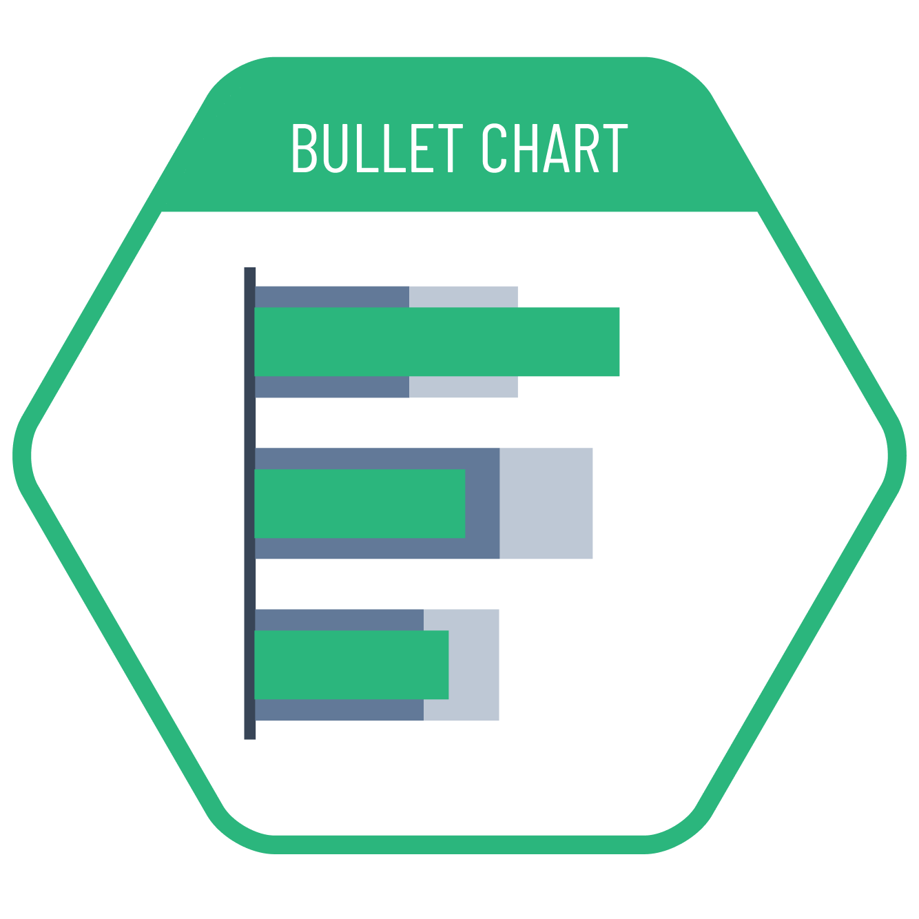
In cases where we want to make comparison with the supporting data with levels, bullet charts are the most appropriate visualization type. Such charts prepared with gradual levels of supporting data are particularly suitable for comparisons like actual values vs targets or budgets. In addition to the background support data with tiered levels, different support values can also be visualized using notches of various shapes.
VISUAL PERFORMANCE CHART
VISUAL CREATION PLATFORMS

Do you have any ideas or examples related to this graphic that you would like to see published here?
Share Here