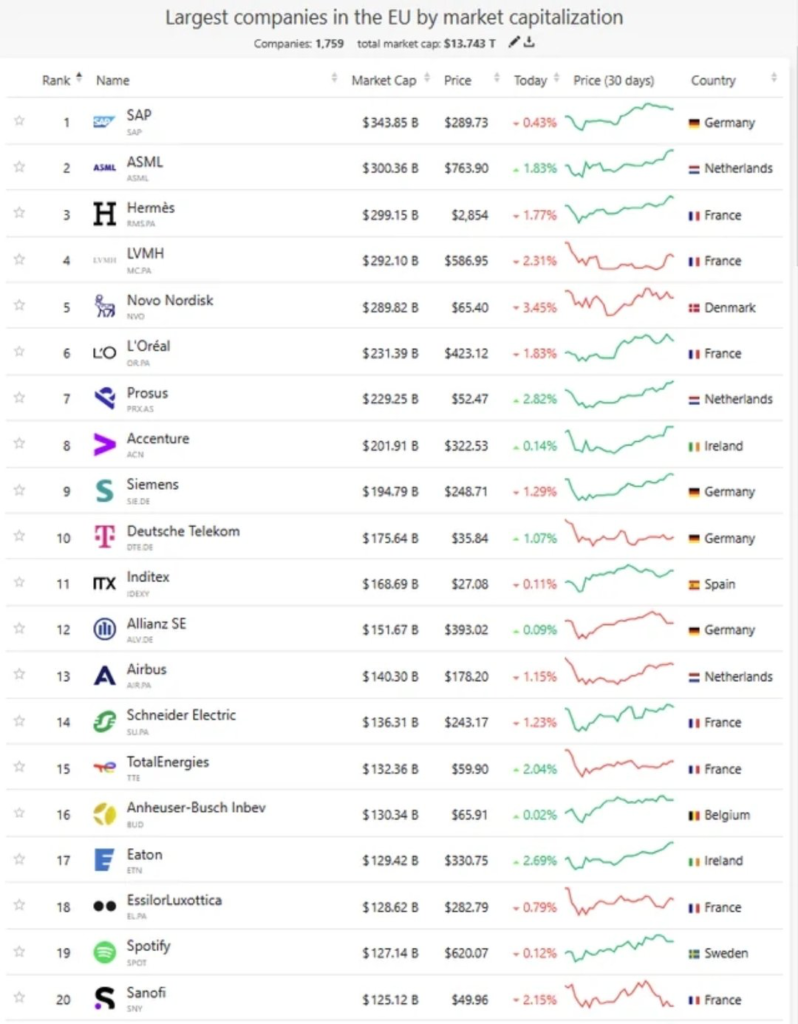
When we want to visualize multiple values across several columns for a single row, or numerical data across multiple rows for a single column, we can use sparklines. Since there is no space in sparklines to display category labels, they are most commonly used to visualize temporal datasets. As these charts are placed within a single cell of a table, it’s important to use the simplest and most familiar visual formats. Therefore, sparklines typically come in only three forms: column, line, and win/loss charts.
VISUAL PERFORMANCE CHART
VISUAL CREATION PLATFORMS

SAMPLE IMAGES
Do you have any ideas or examples related to this graphic that you would like to see published here?
Share Here