3D density maps are charts where we visualize the density of a data in the 3rd dimension on a 2D map. In order to display all of the data, maps on the surface should be tilted at an angle so that too much data is not left behind the long columns. The perspective effect that may occur due to rotation in three dimensions in these visualizations can be problematic. Because it is inevitable that those close to us will be seen as larger and those farther away will be seen as smaller. For this reason, 3D density maps become an alternative with their attractive appearance rather than a comparison of values.
VISUAL PERFORMANCE CHART
VISUAL CREATION PLATFORMS

SAMPLE VISUAL REVIEW
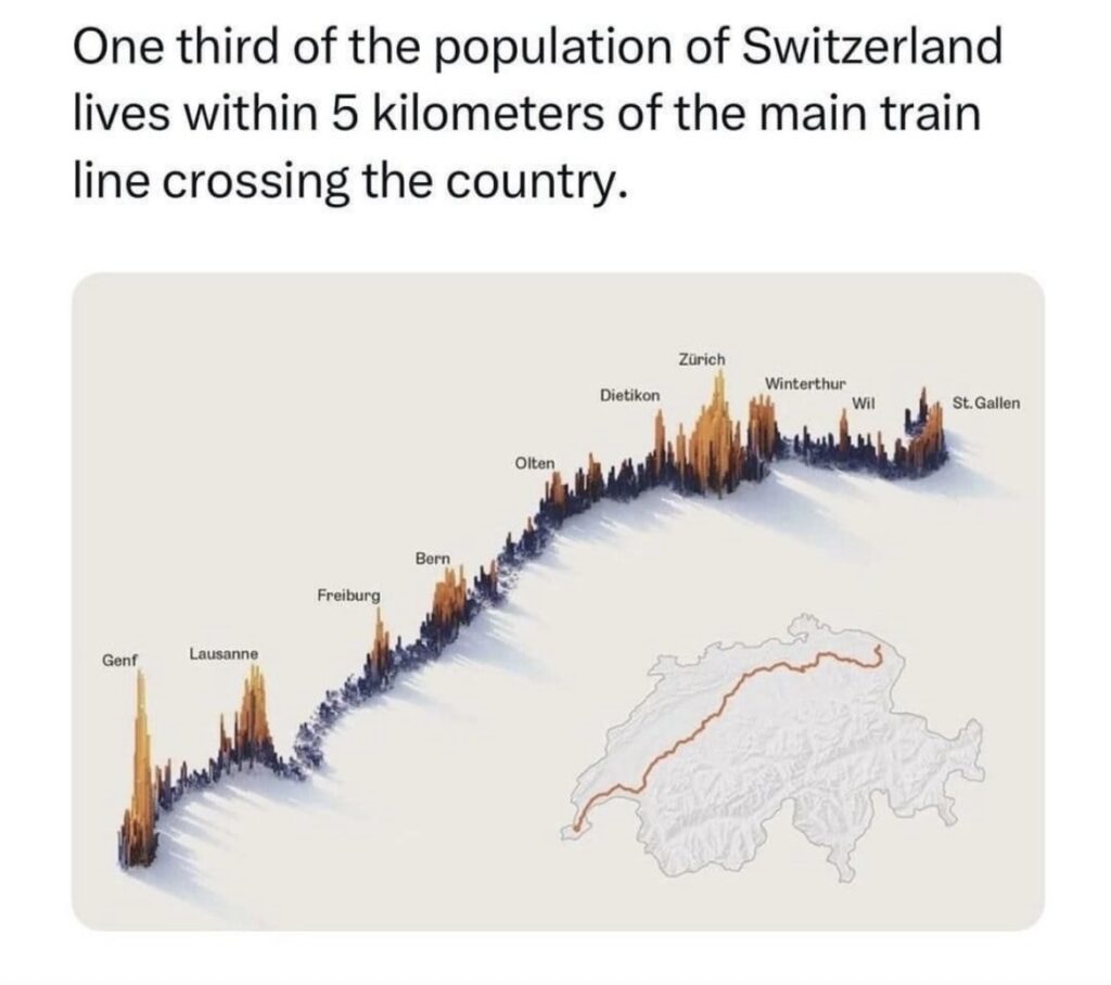
This graphic shows the density of the population of Switzerland, which is located on the main train line, where one third of the country’s population lives. The narrative is strengthened with an additional map display showing where the train line goes from one place to another in the country. We can say that 3D provides serious reading motivation for the reader. In fact, since we cannot rotate the visual, we cannot see any other data points behind the high bars; however, it was deemed sufficient for the person who created the graphic to show where the general density is. In addition, the bars are supported with color, making it easier to understand where the high bars are. The use of a contrasting palette as coloring makes us think that the graphic designer has a positive/negative threshold in his eyes.
SAMPLE IMAGES


Do you have any ideas or examples related to this graphic that you would like to see published here?
Share Here