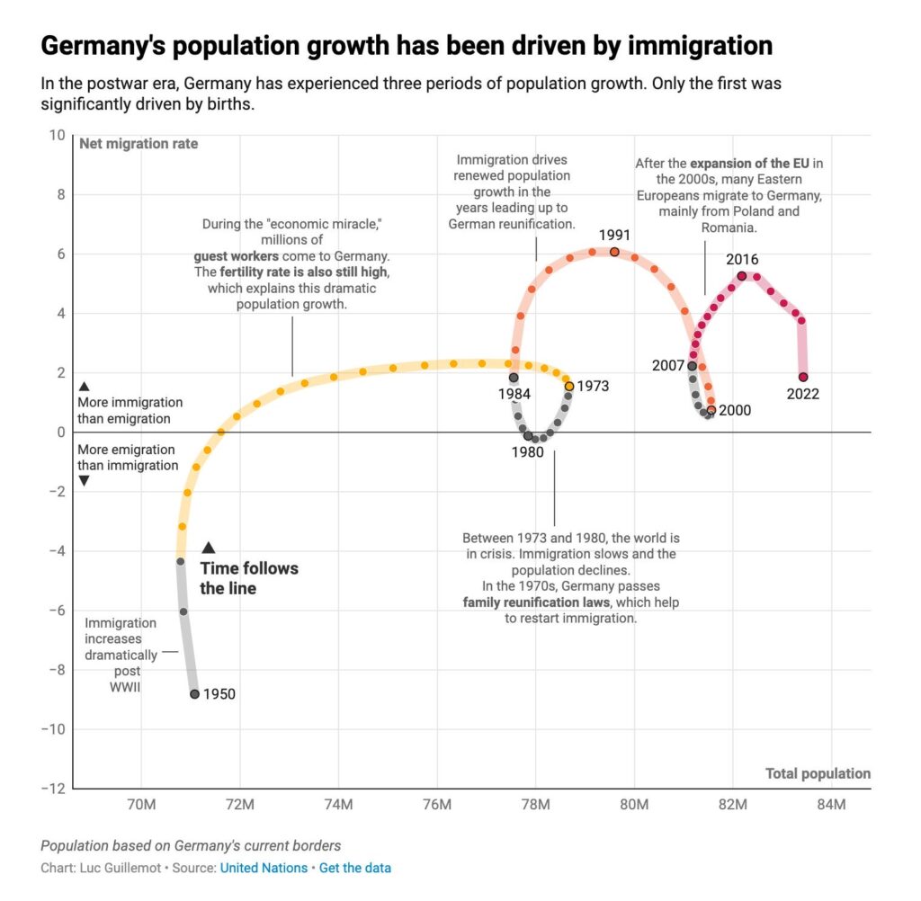
When we want to visualize the values of a single data point across many time units or the before-after status of multiple data points, we use a connected scatter plot. It’s hard to show the effect of time in classic scatter plots as they display two different parameters on the axes,. This can only be achieved by connecting sequential data points with a line. The time direction must be clearly indicated, as this type of chart can be confused with a line chart and it may be wrongly assumed that values always flow from left to right.
VISUAL PERFORMANCE CHART
VISUAL CREATION PLATFORMS

Do you have any ideas or examples related to this graphic that you would like to see published here?
Share Here