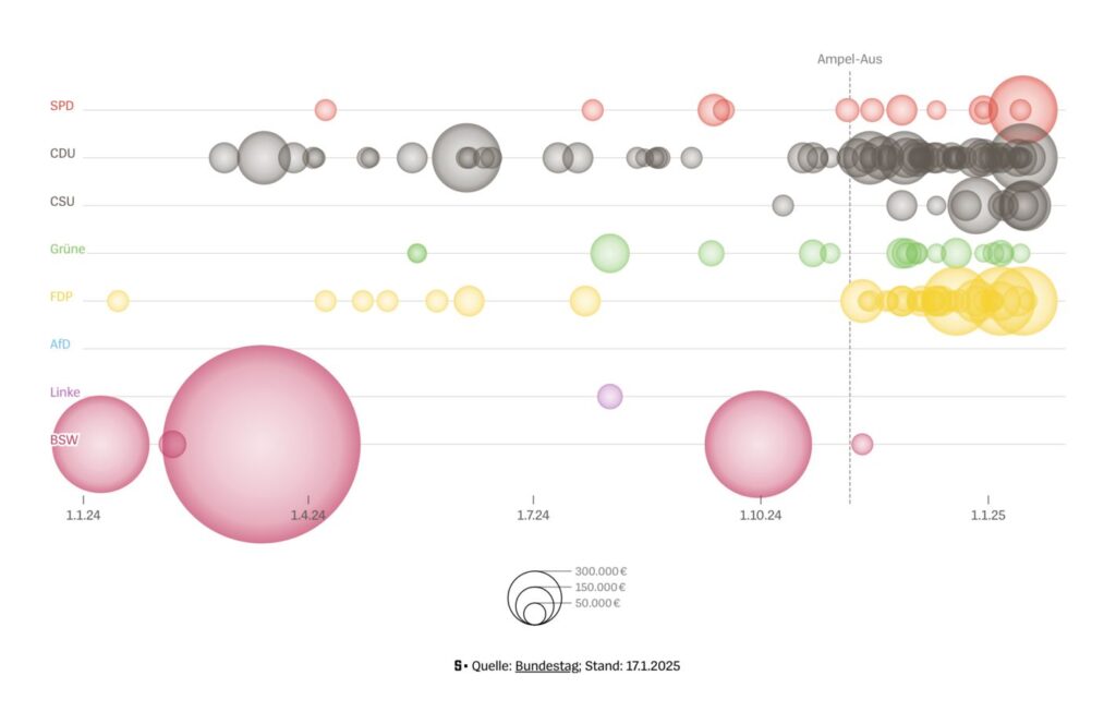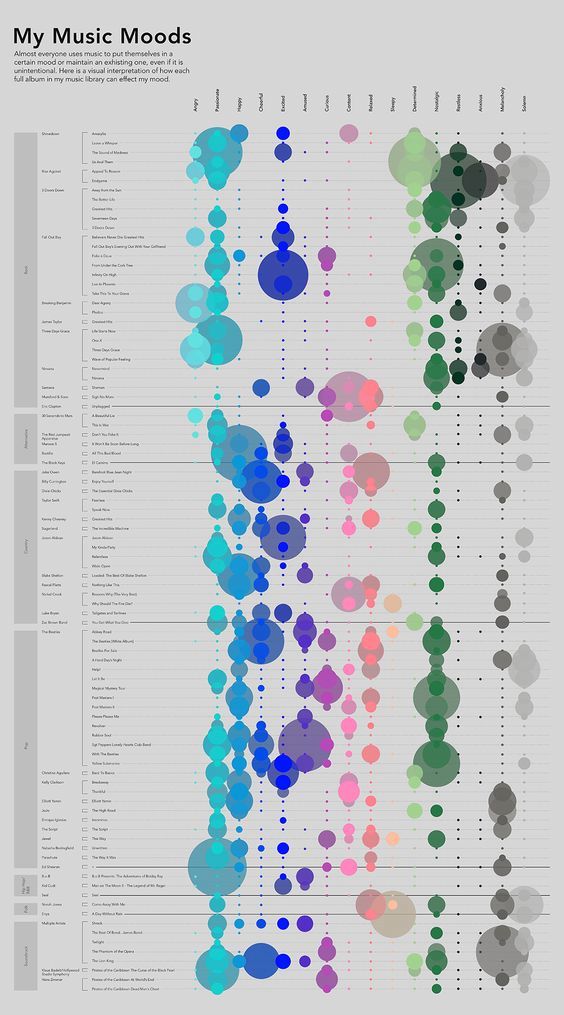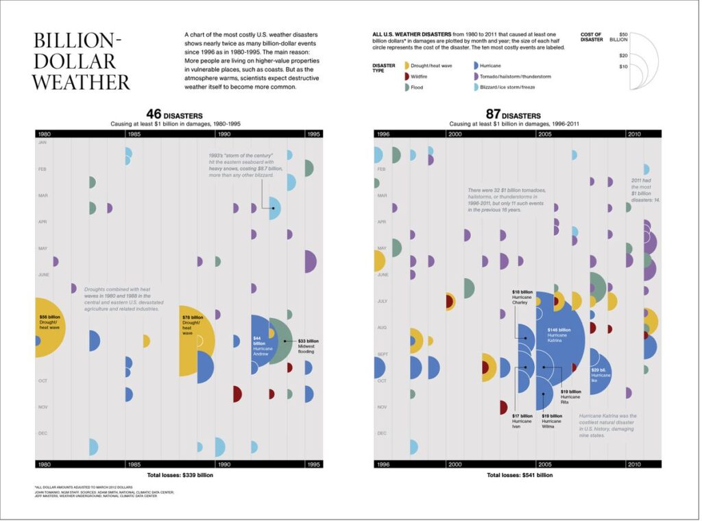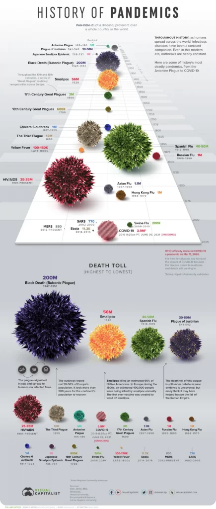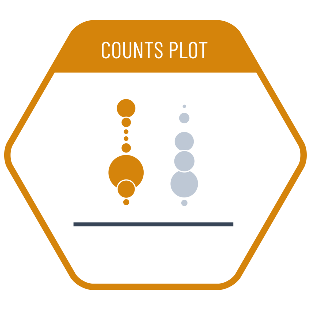
Charts that represent overlapping data points with the same value by using circles scaled by area are called counts plots. Even when the values are not identical but similar, the circles may overlap. Therefore, using transparency is recommended to prevent them from obscuring one another. Counts plots are also useful when we want to compare average values and data densities across categorical subgroups.
VISUAL PERFORMANCE CHART
VISUAL CREATION PLATFORMS

SAMPLE IMAGES
Do you have any ideas or examples related to this graphic that you would like to see published here?
Share Here