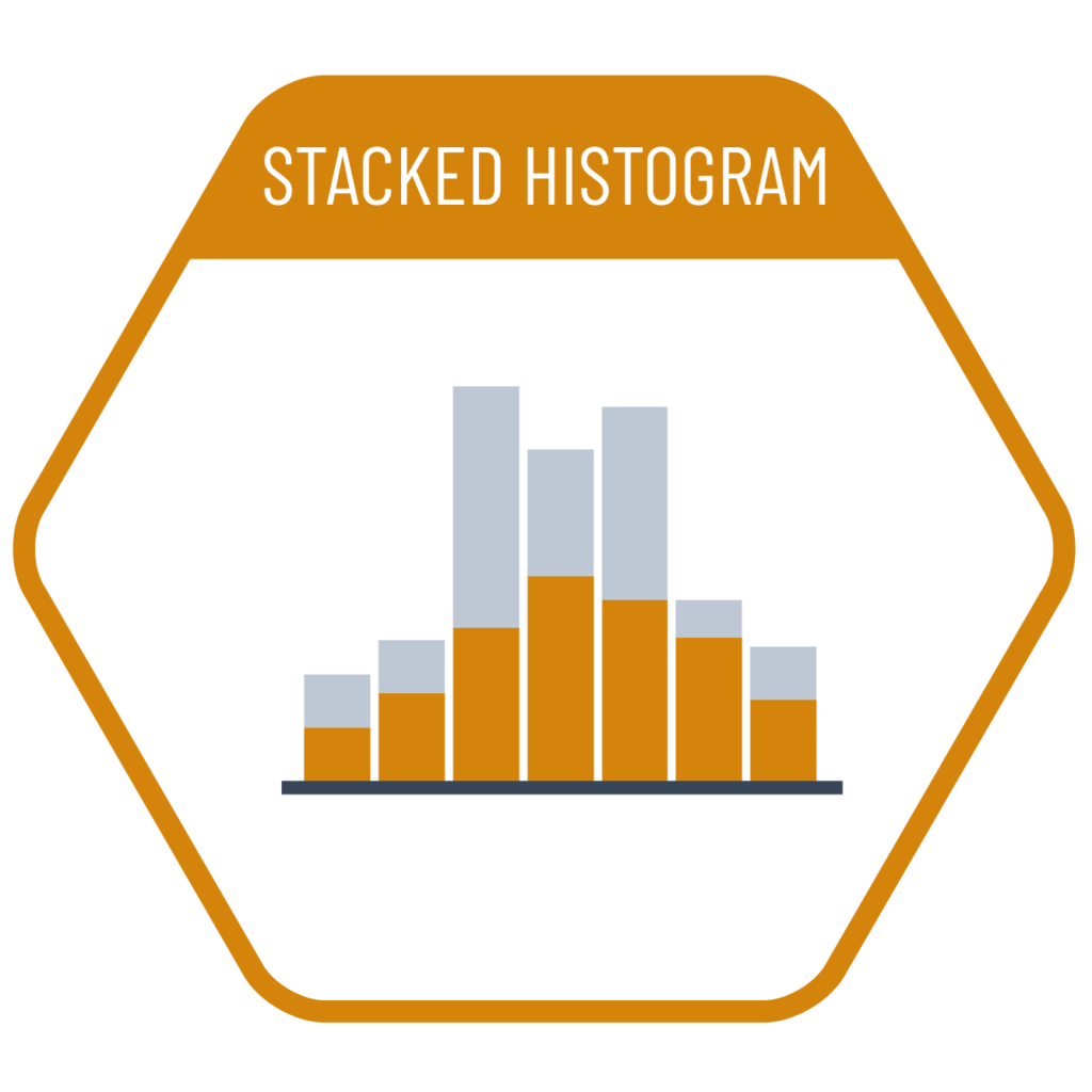
If the dataset whose distribution we want to visualize includes a subgroup breakdown, we can use a stacked histogram to both reflect that breakdown and show the overall distribution. In these charts, the most readable parts are typically the lowest segment, which corresponds to the base category—similar to a standard stacked column chart. Therefore, when ordering the subgroups, it is advisable to place the category whose distribution we most want to emphasize at the bottom.
VISUAL PERFORMANCE CHART
VISUAL CREATION PLATFORMS

Do you have any ideas or examples related to this graphic that you would like to see published here?
Share Here