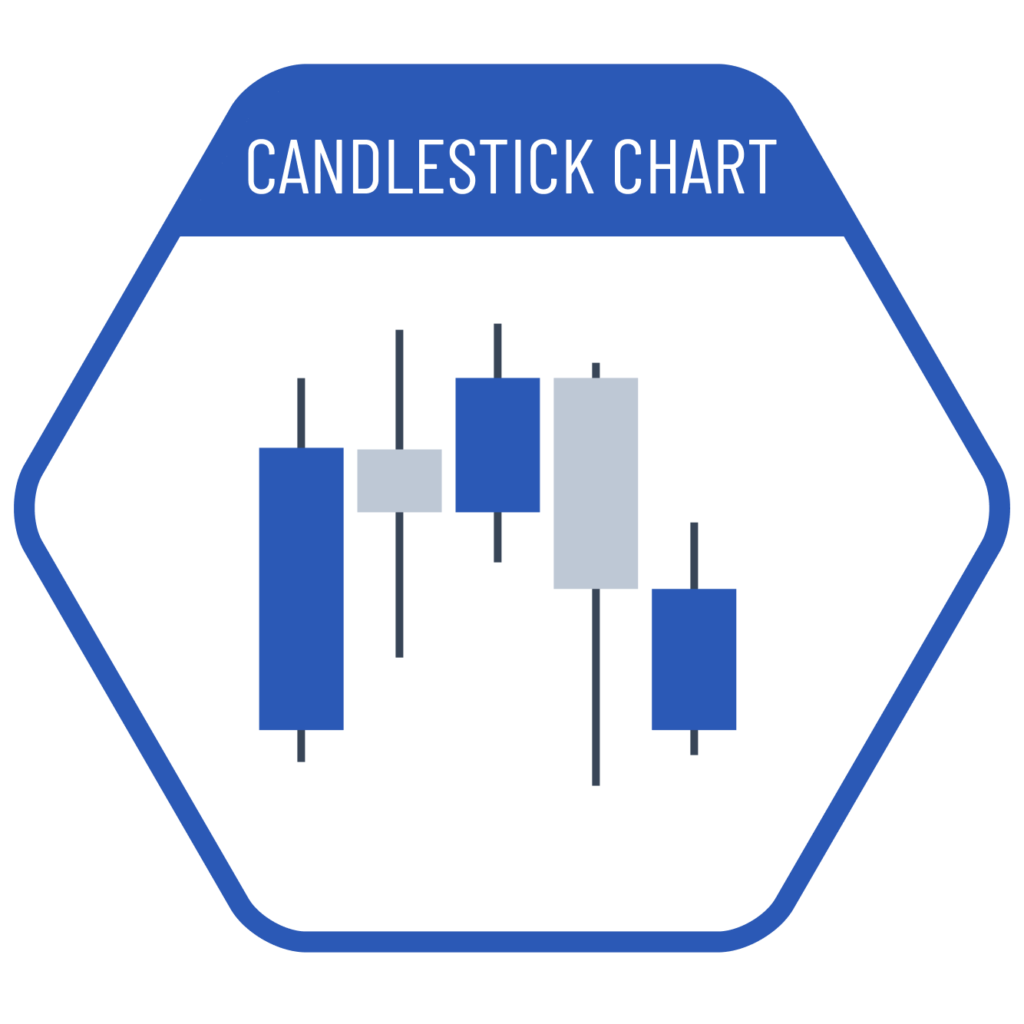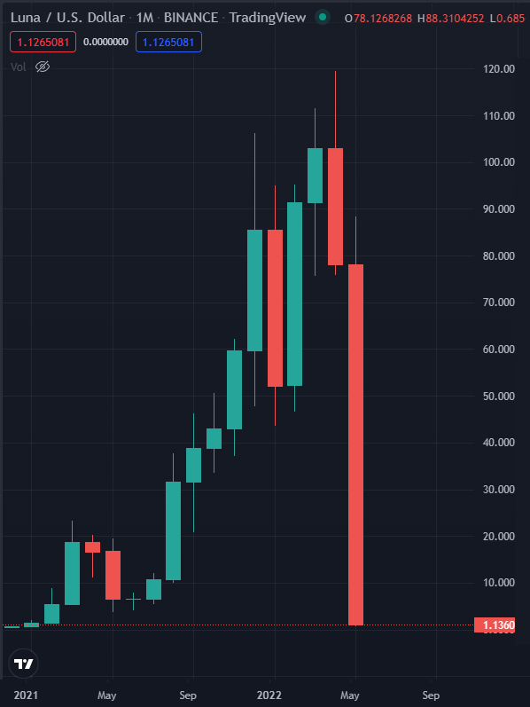
Candlestick charts can be considered as a variant of waterfall charts. The boxes in these charts show the difference between the current time step and the previous one, similar to waterfall charts. One side of the box represents the opening value, while the other side represents the closing value (OHLC). The color helps the reader quickly identify whether the change is positive or negative. The vertical line extending from the box represents the minimum and maximum values reached within that time period. A variation of this chart is the open-high-low-close (OHLC) chart.
VISUAL PERFORMANCE CHART
VISUAL CREATION PLATFORMS

SAMPLE IMAGES
Do you have any ideas or examples related to this graphic that you would like to see published here?
Share Here