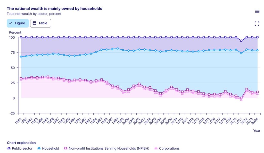
100% stacked area charts, as implied by the term ‘stacked’, represent a total, while the ‘100%’ indicates proportions within that total. The area chart format further conveys how these proportions change over time. Since the sum of all categories always equals 100%, data series placed at both the bottom and top allow for easy visual comparison. Therefore, this should be considered when ordering data series. If there are more than five categories, grouping and color-coding should be considered for better readability.
VISUAL PERFORMANCE CHART
VISUAL CREATION PLATFORMS

SAMPLE IMAGES
Do you have any ideas or examples related to this graphic that you would like to see published here?
Share Here