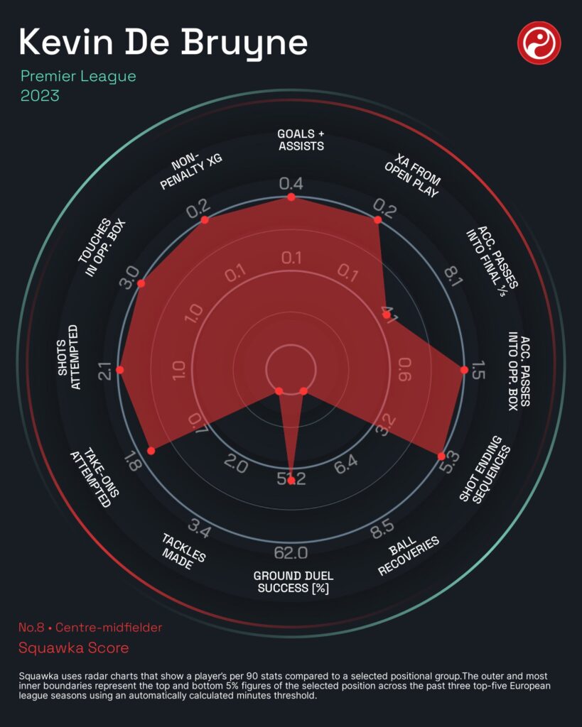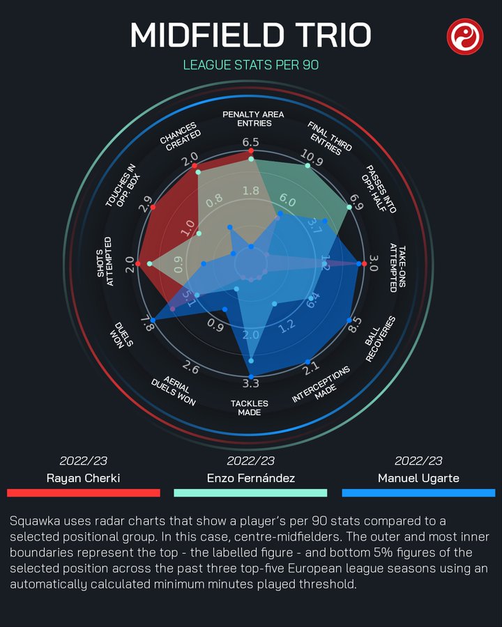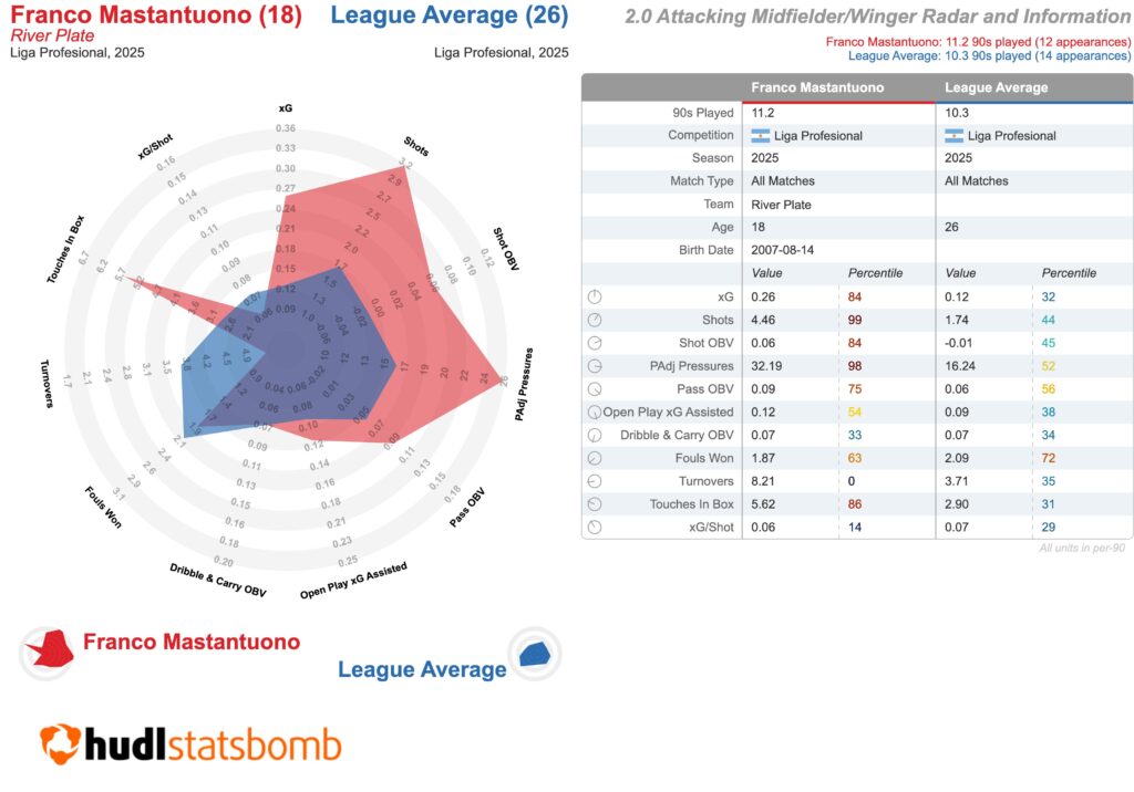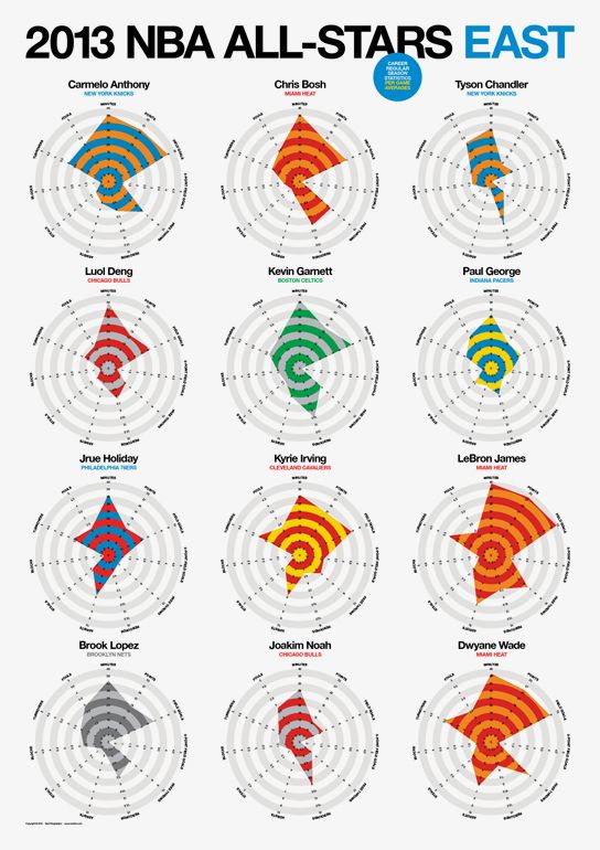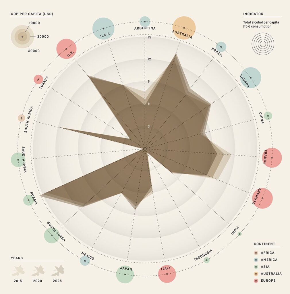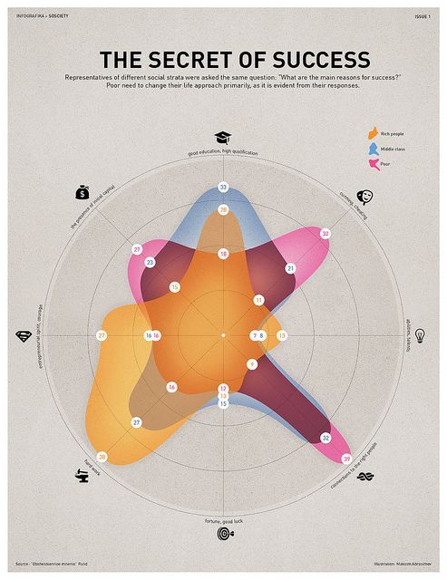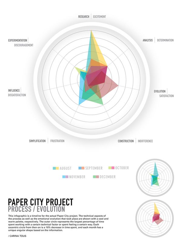
When there are various data series to compare along with multiple categories, the spider net chart is an ideal choice. It can be used for ratio comparisons as well as value comparisons, making it function also as a chart type of partition class. While some applications/tools call it a radar chart, its appearance resembles a spider net more closely. We can visualize multiple datasets through lines or a dataset using areas.
VISUAL PERFORMANCE CHART
VISUAL CREATION PLATFORMS

SAMPLE IMAGES
Do you have any ideas or examples related to this graphic that you would like to see published here?
Share Here