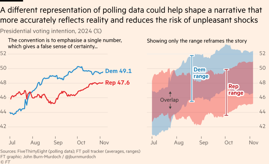
When the range within which data values fall is as important as the values of our dataset, we can use a range chart instead of a column chart. In this chart, columns (bars) do not start from the zero axis but instead represent minimum-maximum intervals. If the comparison categories are time-related, the chart becomes a chart type in time class. While we can simply use the column, scatter or line chart when we only want to display average values, usage of range chart becomes ideal when we want to focus on the minimum-maximum range.
VISUAL PERFORMANCE CHART
VISUAL CREATION PLATFORMS

SAMPLE IMAGES
Do you have any ideas or examples related to this graphic that you would like to see published here?
Share Here
