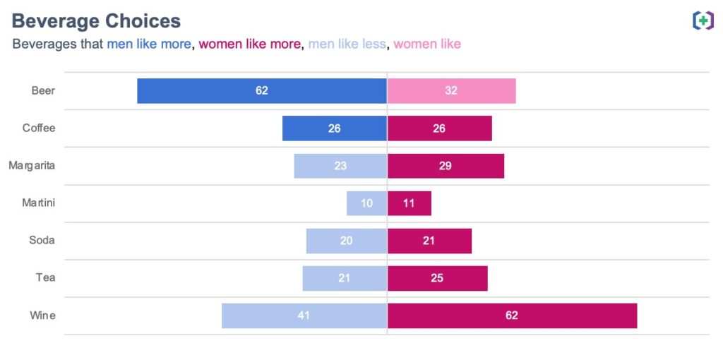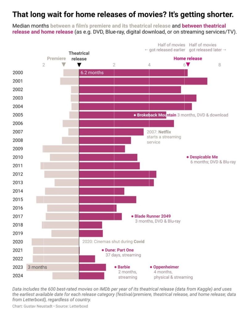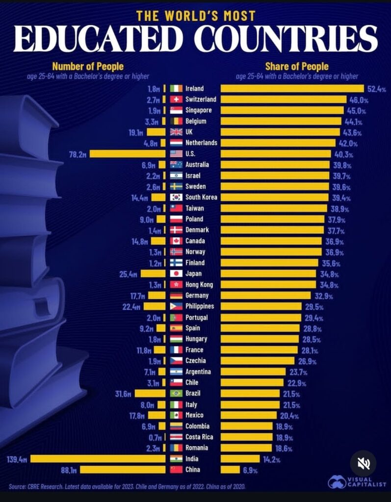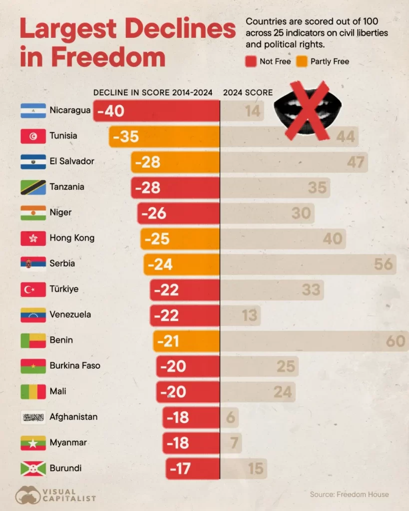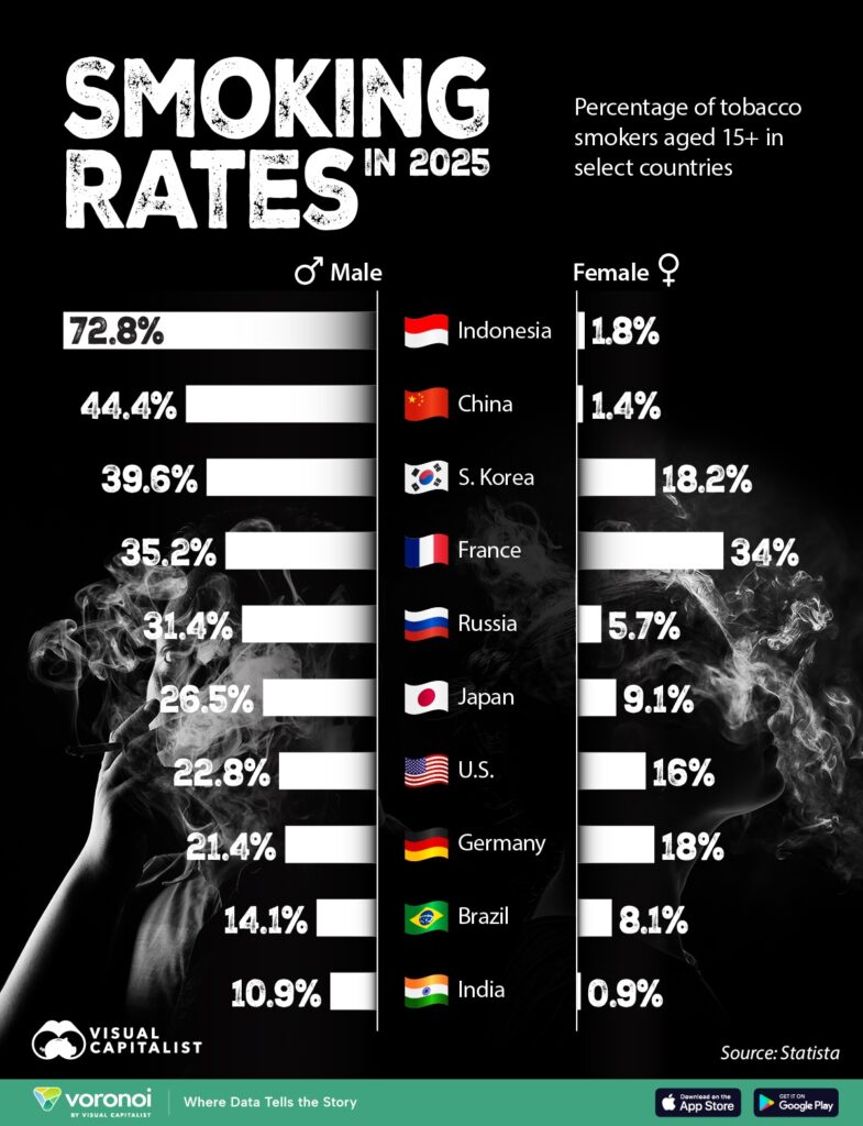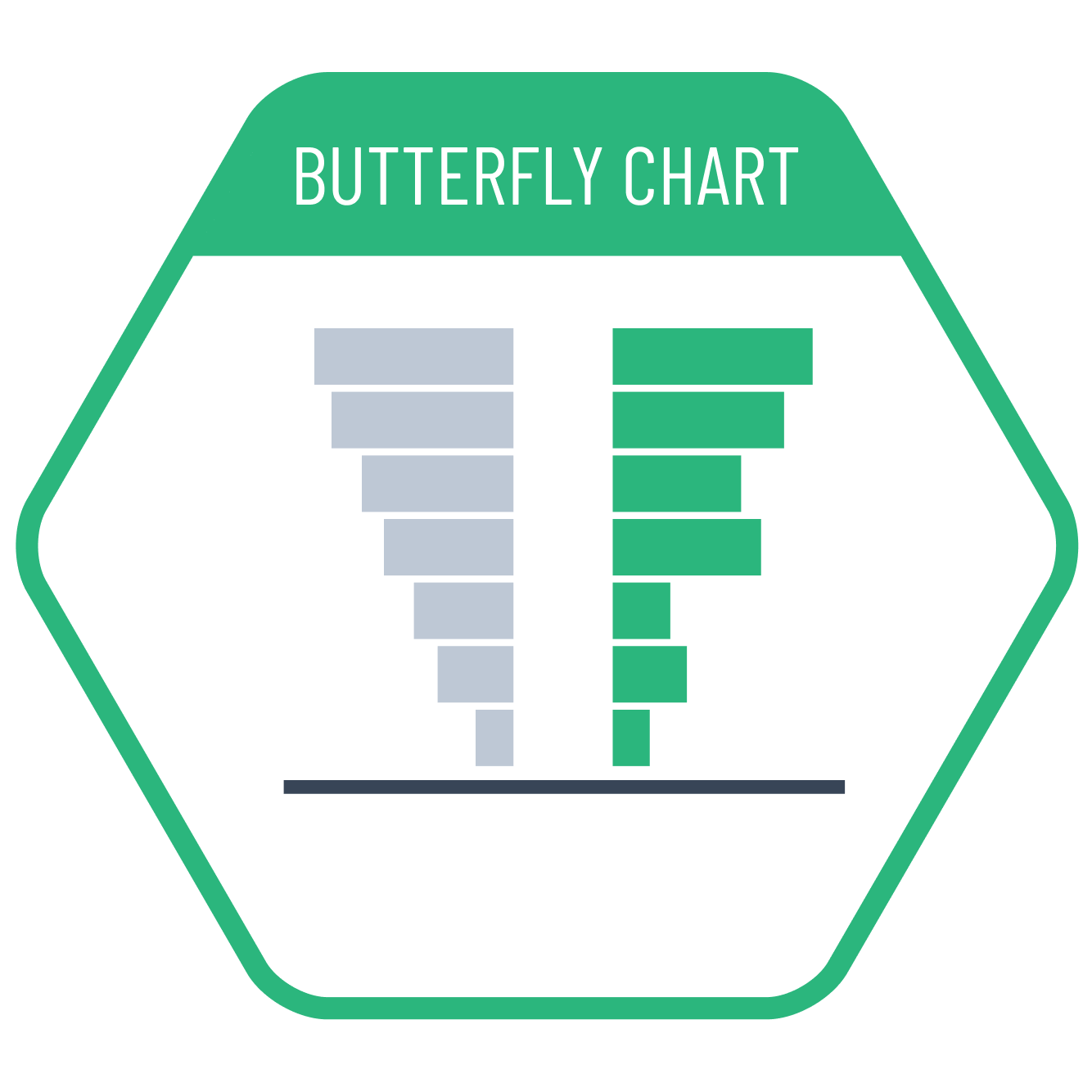
If the emphasis in a stacked bar chart is on the comparison of two equally important values rather than a positive-negative comparison, we can create a butterfly chart by placing category labels in the center. However, since the bars do not start at the same point and move in opposite directions, value comparison is less intuitive compared to traditional bar charts. Therefore, butterfly charts are more suitable for general comparisons rather than for small value differences.
VISUAL PERFORMANCE CHART
VISUAL CREATION PLATFORMS

SAMPLE IMAGES
Do you have any ideas or examples related to this graphic that you would like to see published here?
Share Here