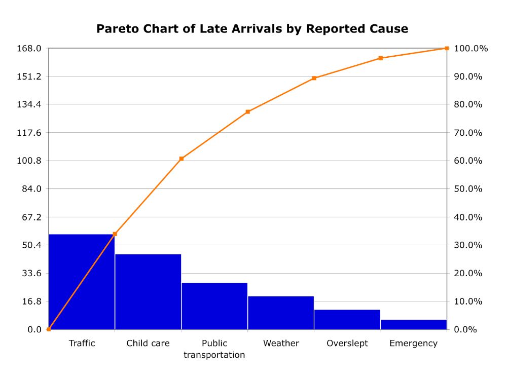
This chart is used to visualize the Pareto distribution and the 80/20 rule, introduced by Italian economist Vilfredo Pareto in the late 19th and early 20th centuries. Pareto charts show the ranking of data within a system and their cumulative proportion. Therefore, data must always be arranged and sorted in descending order. For example, we can consider that the reasons that account for 80% of customer complaints are our most important categories and we should focus our efforts on them.
VISUAL PERFORMANCE CHART
VISUAL CREATION PLATFORMS

SAMPLE IMAGES
Do you have any ideas or examples related to this graphic that you would like to see published here?
Share Here