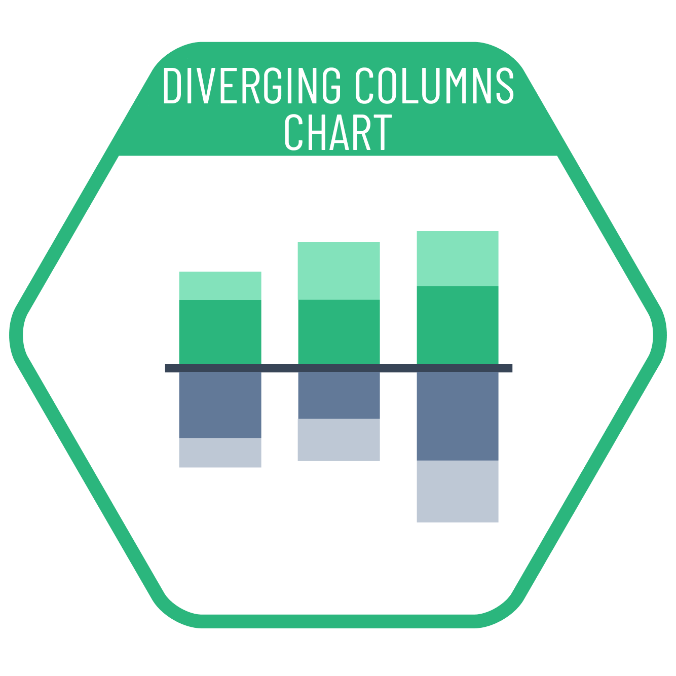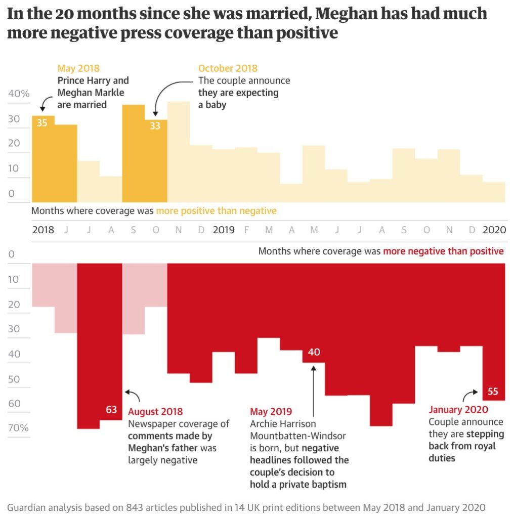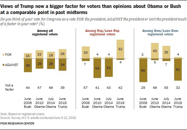
In column charts, the comparison above and below the zero line provides a clear visual comparison between positivity and negativity. Therefore diverging stacked column charts are the most suitable chart type when we want to compare the total of positive and negative values or differentiate between favorable and unfavorable totals even though they are both positive.
VISUAL PERFORMANCE CHART
VISUAL CREATION PLATFORMS

SAMPLE IMAGES
Do you have any ideas or examples related to this graphic that you would like to see published here?
Share Here
