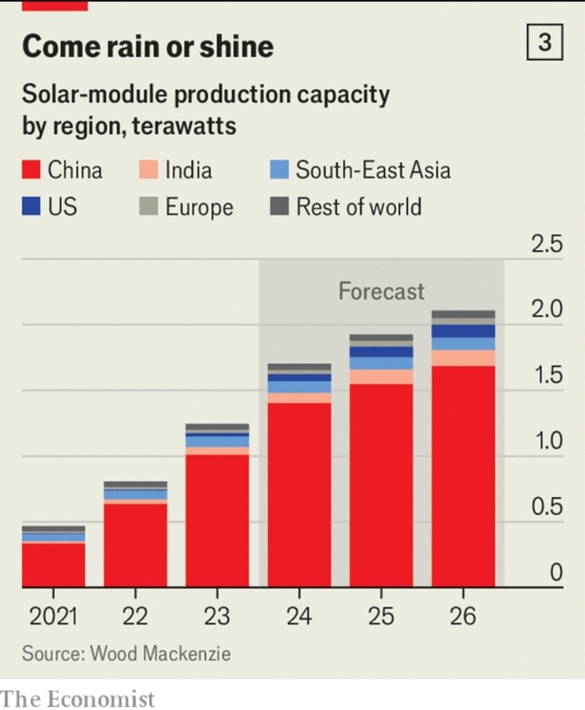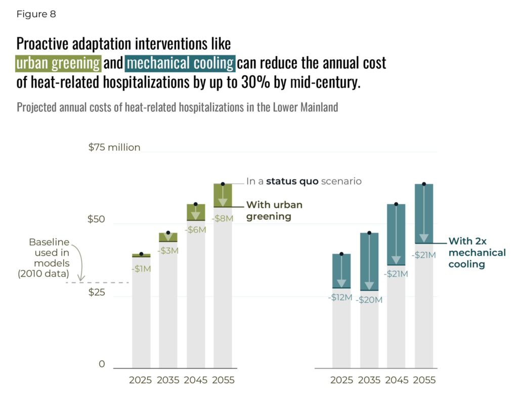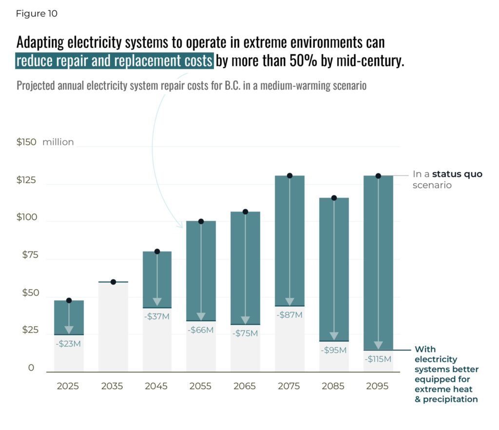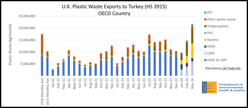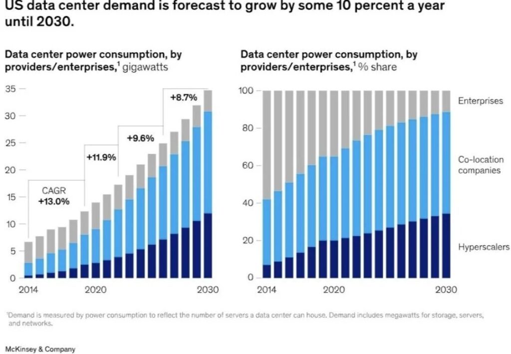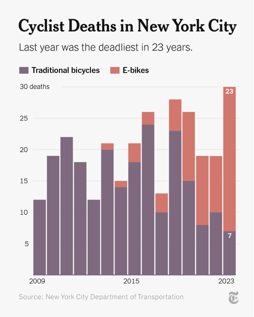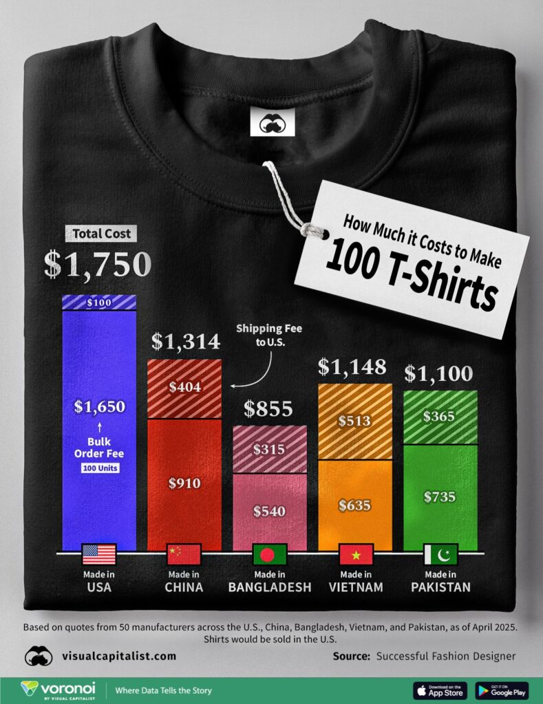
The stacked column chart is the most common chart used when we want to compare the total of one of the categorical breakdowns in a dataset with two categorical dimensions. It shows the contribution of each value to the total across categories, highlighting the relationship between individual elements and the whole. The visualization should be designed according to the total of the more important categorical breakdown. Comparing all subcategories can be challenging, but the values provided at the bottom and the total are easily comparable.
VISUAL PERFORMANCE CHART
VISUAL CREATION PLATFORMS

SAMPLE IMAGES
Do you have any ideas or examples related to this graphic that you would like to see published here?
Share Here
