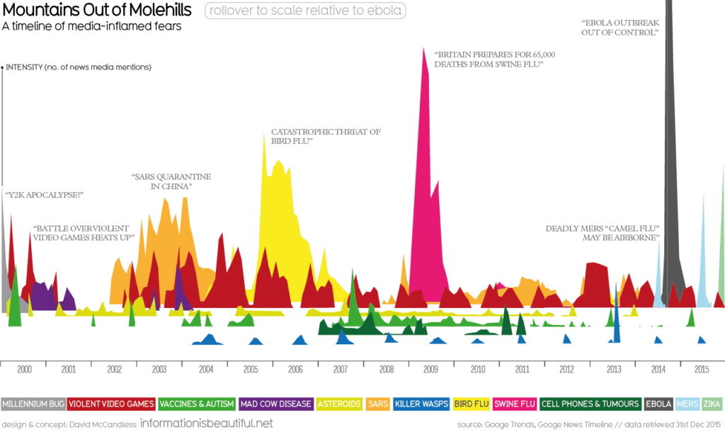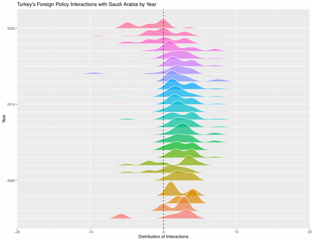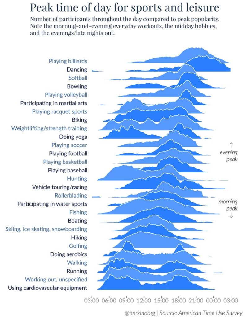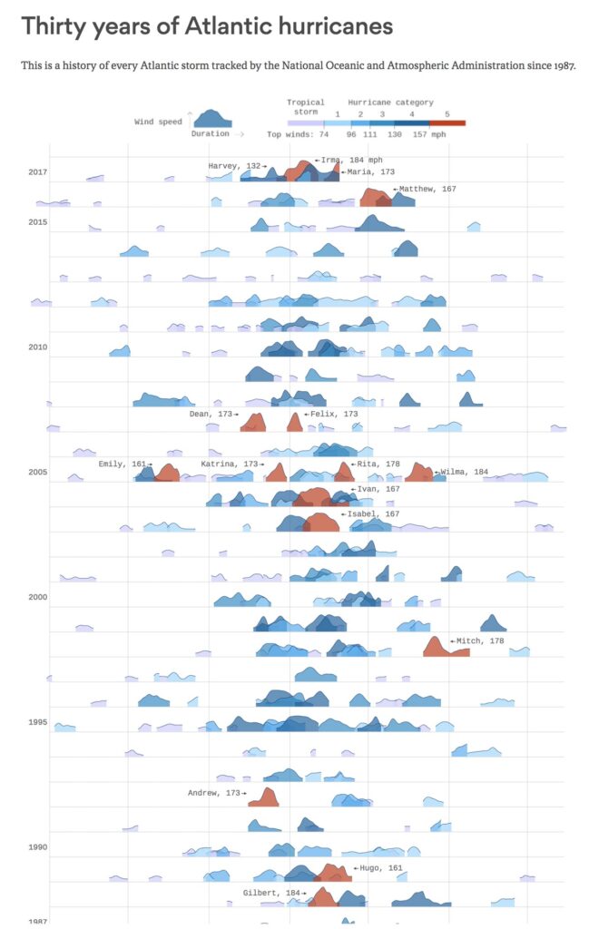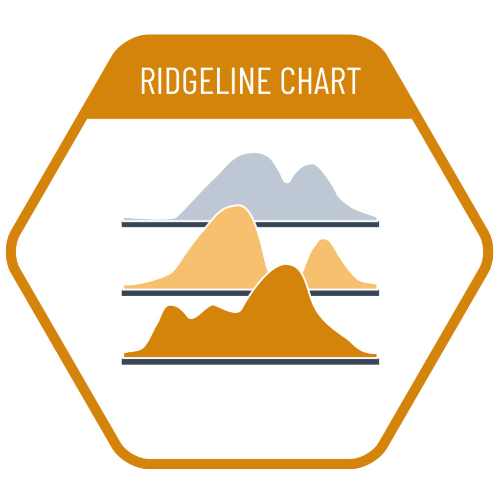
A ridgeline chart is used to compare the distributions of categorical subgroups. When the number of categories in the dataset is high, lines or areas may overlap too much, making the chart difficult to read. In such cases, the ridgeline chart becomes a more suitable solution by adding space between the areas to prevent overlap. The height of each ridge is usually set below the maximum value, so overlapping areas may partially obscure background distributions. However, since the amount of hidden data is typically small, this limitation is generally considered negligible.
VISUAL PERFORMANCE CHART
VISUAL CREATION PLATFORMS

SAMPLE IMAGES
Do you have any ideas or examples related to this graphic that you would like to see published here?
Share Here