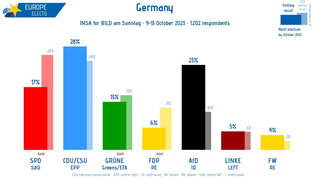
If there is a clear critical/support relationship between the two datasets, an overlapping column chart can be used. Examples of such relationships include: target vs. actual sales, budget vs. spending, past vs. present values, your value vs. industry average, forecast vs. actual, or before-and-after comparisons. As an alternative to the fully nested look, there are also visual variations where the support value is shown as a notch, or thinner column next to the critical one, or where the bars partially overlap rather than being fully embedded.
VISUAL PERFORMANCE CHART
VISUAL CREATION PLATFORMS

SAMPLE IMAGES
Do you have any ideas or examples related to this graphic that you would like to see published here?
Share Here
