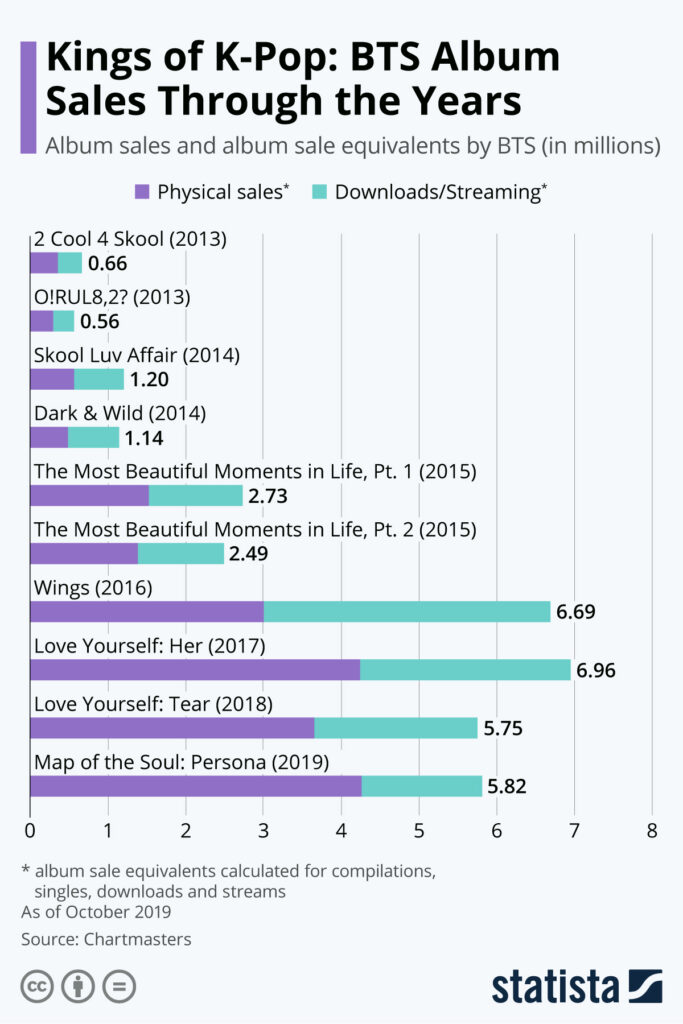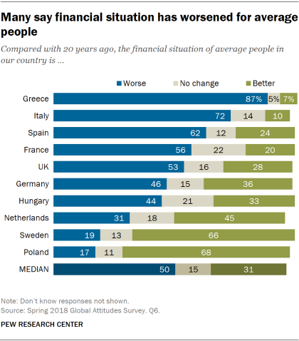
Stacked bar charts are the best choice for comparing totals of one categorical breakdown in a dataset with two categorical dimensions, especially when category names are long. They show the contribution of each value to the total across categories and the relationship between individual elements and the whole. The more critical categorical breakdown’s total should be emphasized in the visualization. Although comparing all subcategories can be challenging, the values placed at the top and the total are easy to interpret.
VISUAL PERFORMANCE CHART
VISUAL CREATION PLATFORMS

SAMPLE IMAGES
Do you have any ideas or examples related to this graphic that you would like to see published here?
Share Here
